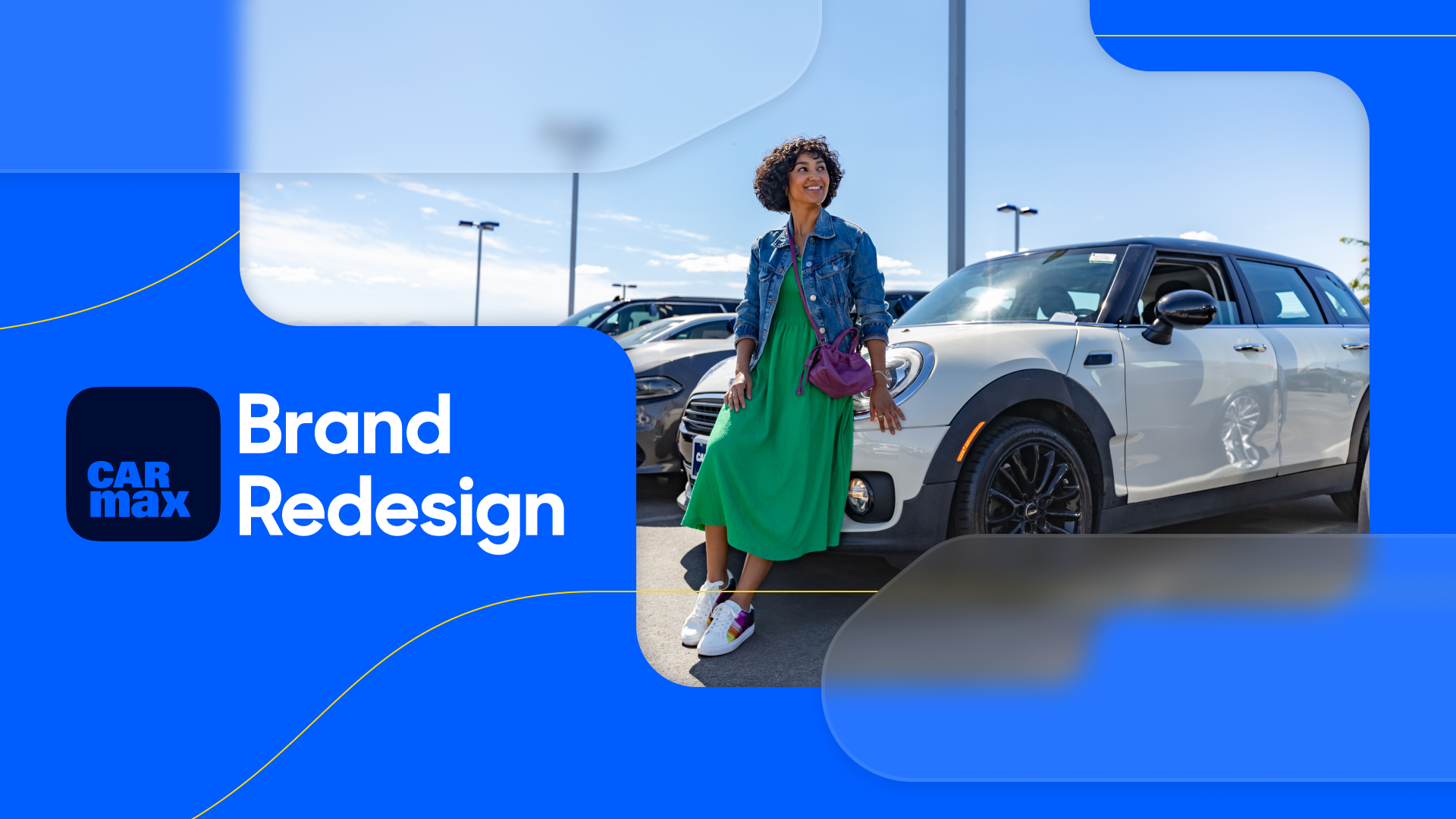
CarMax Brand Refresh & Visual Design Language
Background
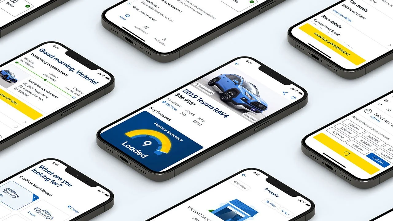
Over the course of the pandemic CarMax fundamentally shifted its business model to become digital-first. After 30 years in business as a brick and mortar retailer you could now take a 360° tour of an electric car on your phone and have it delivered to your driveway without ever stepping foot in one of our stores.
Problem
While our business was stepping on the gas pedal, our brand was seen as stuck in park. When we showed people our logo they said they thought we were unrecognizable and not ready for the future. How might we shift people’s perceptions of our brand by changing the way we present ourselves to the world?
Solution
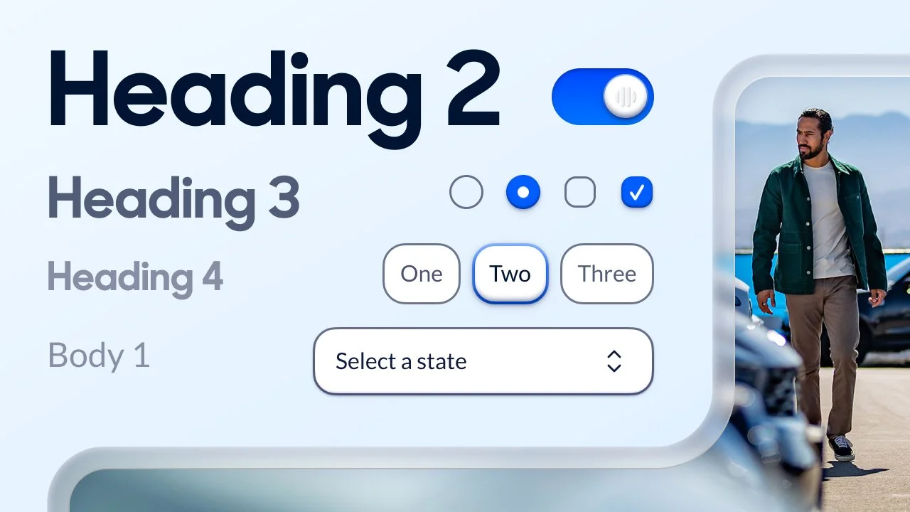
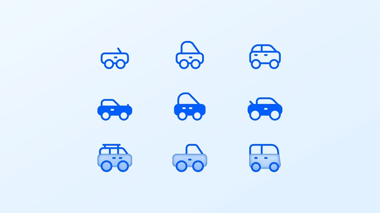
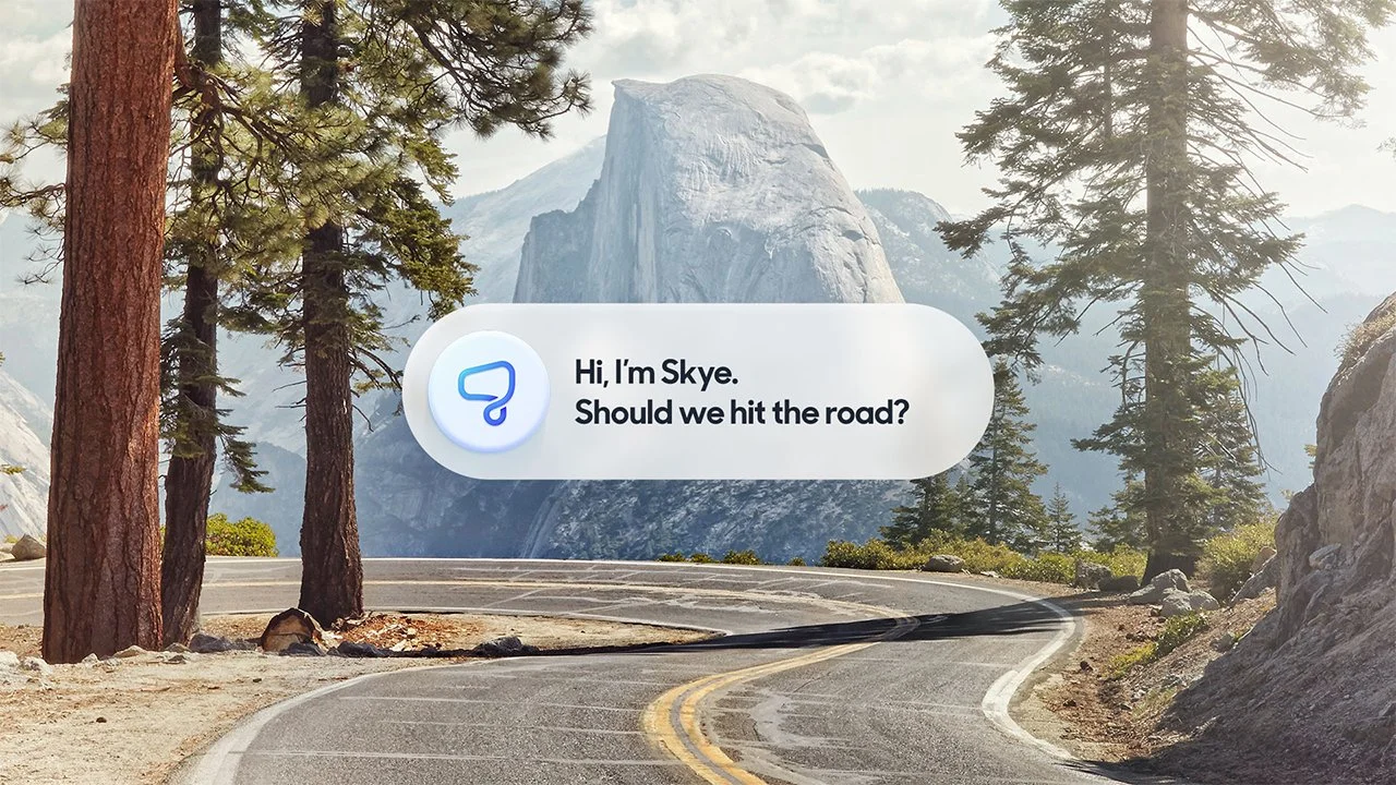
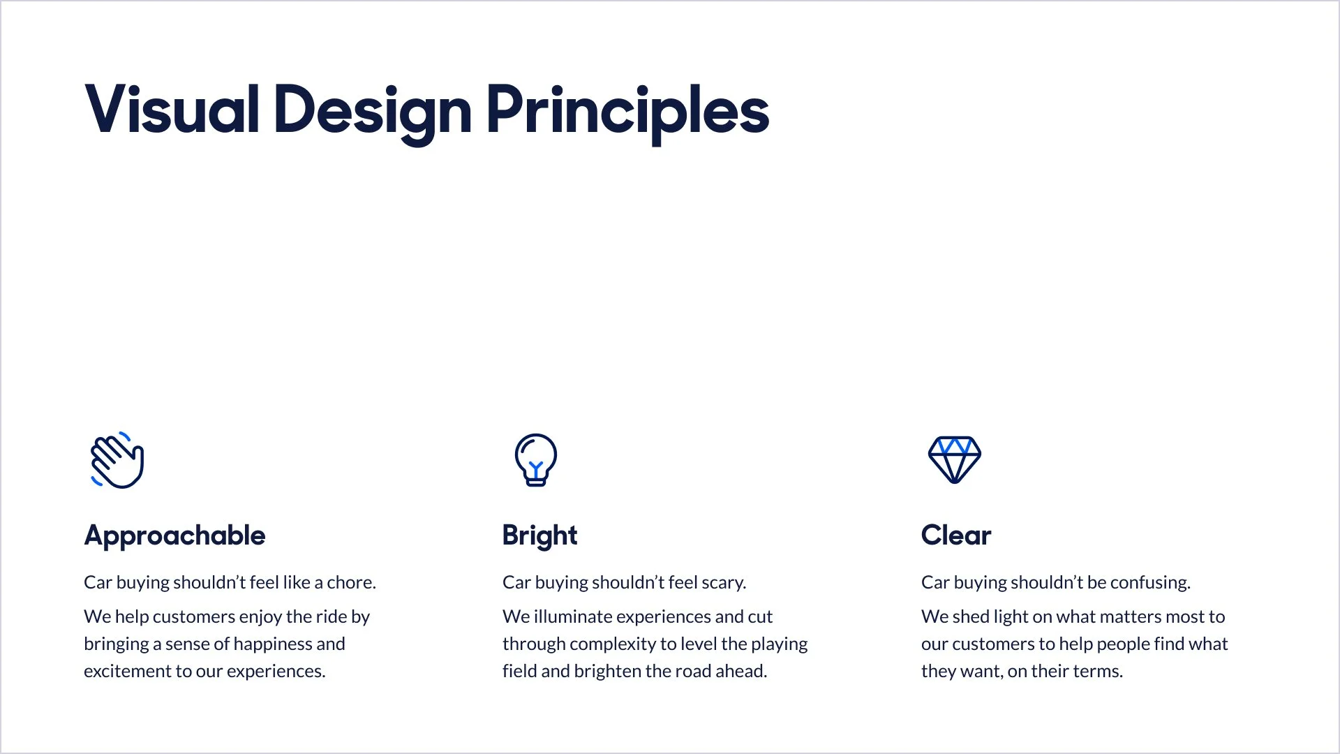
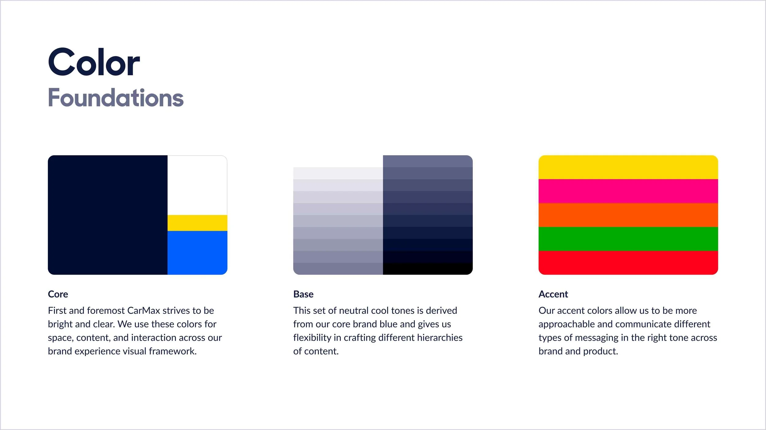
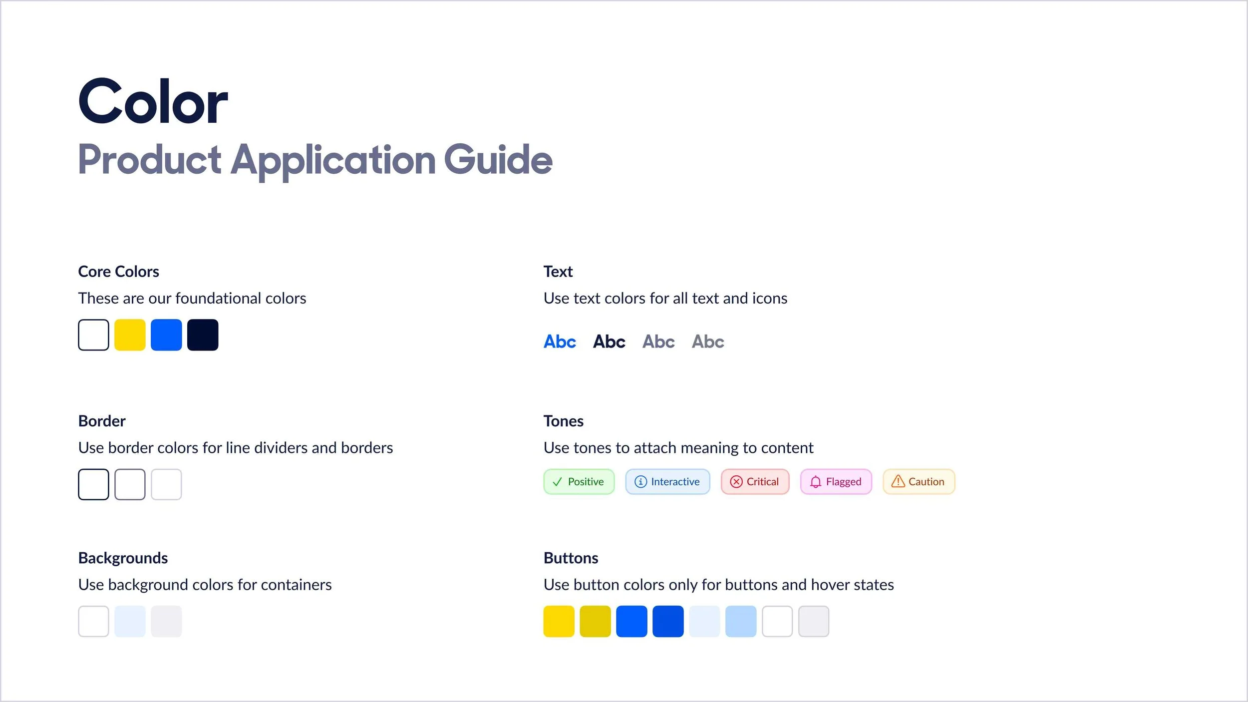
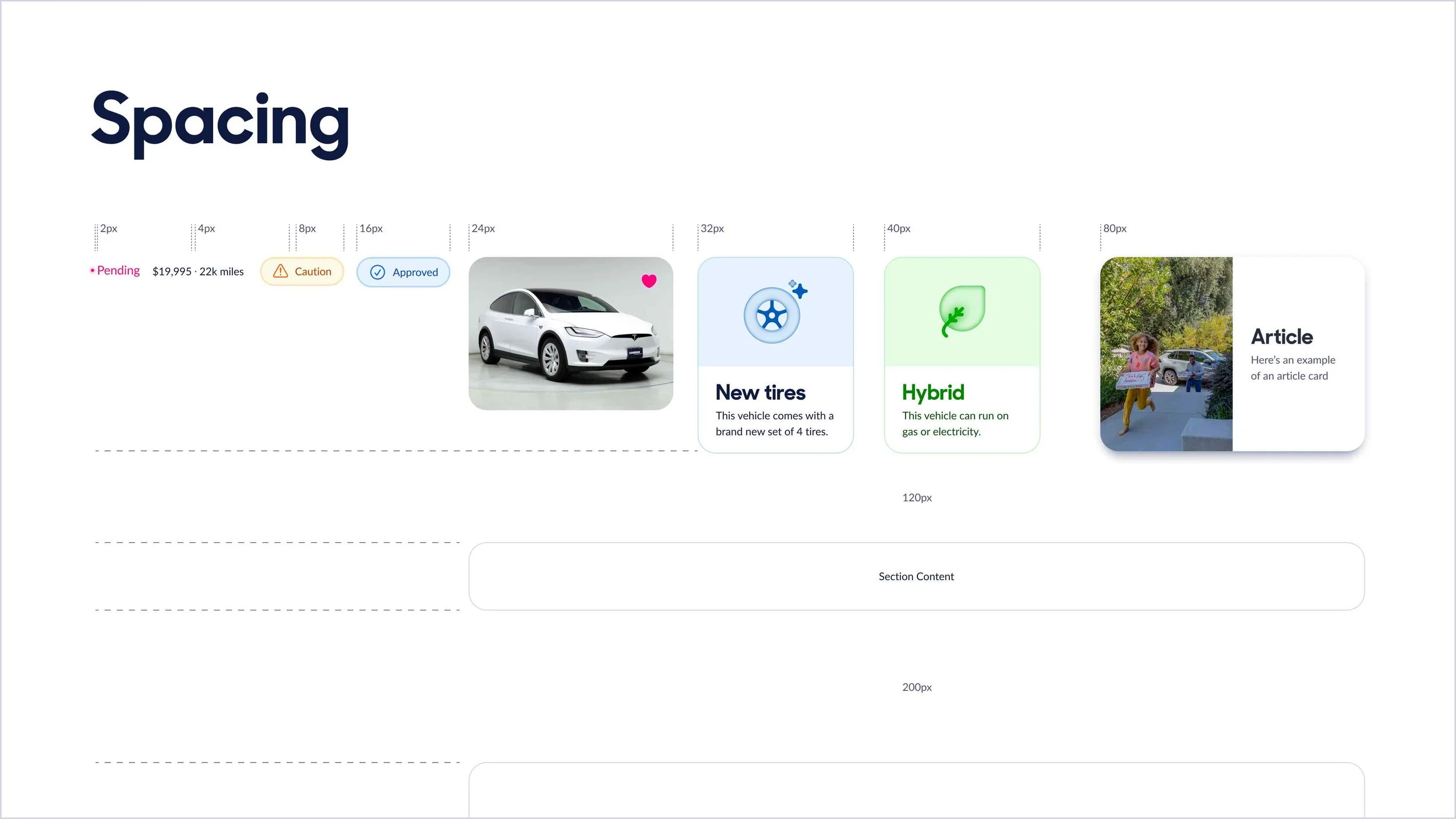
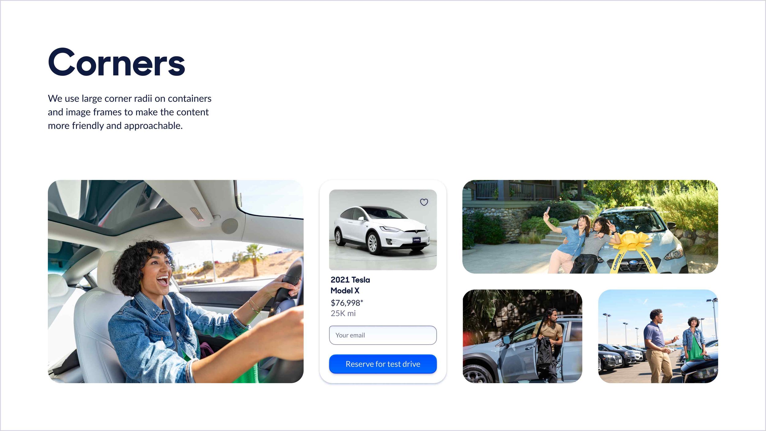
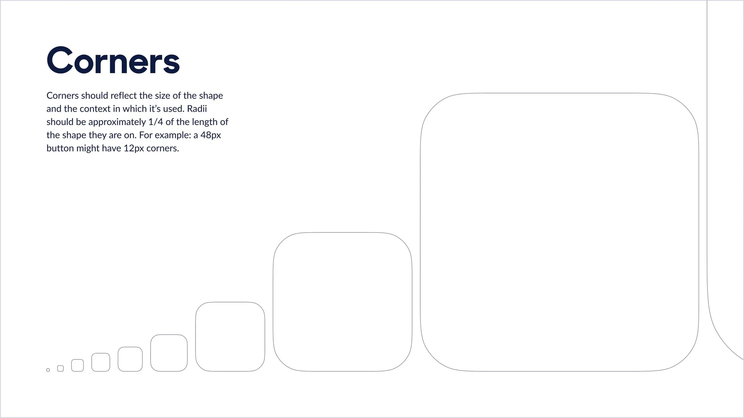
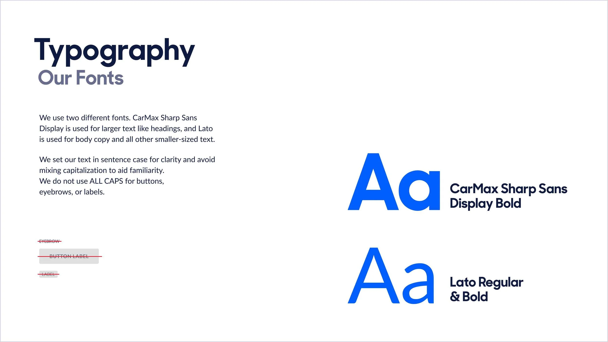
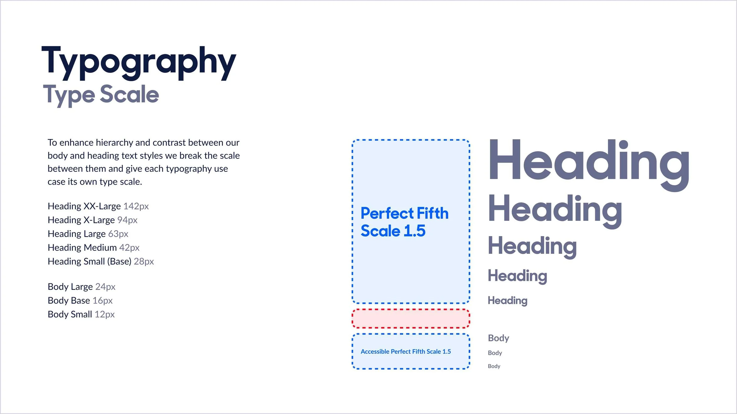
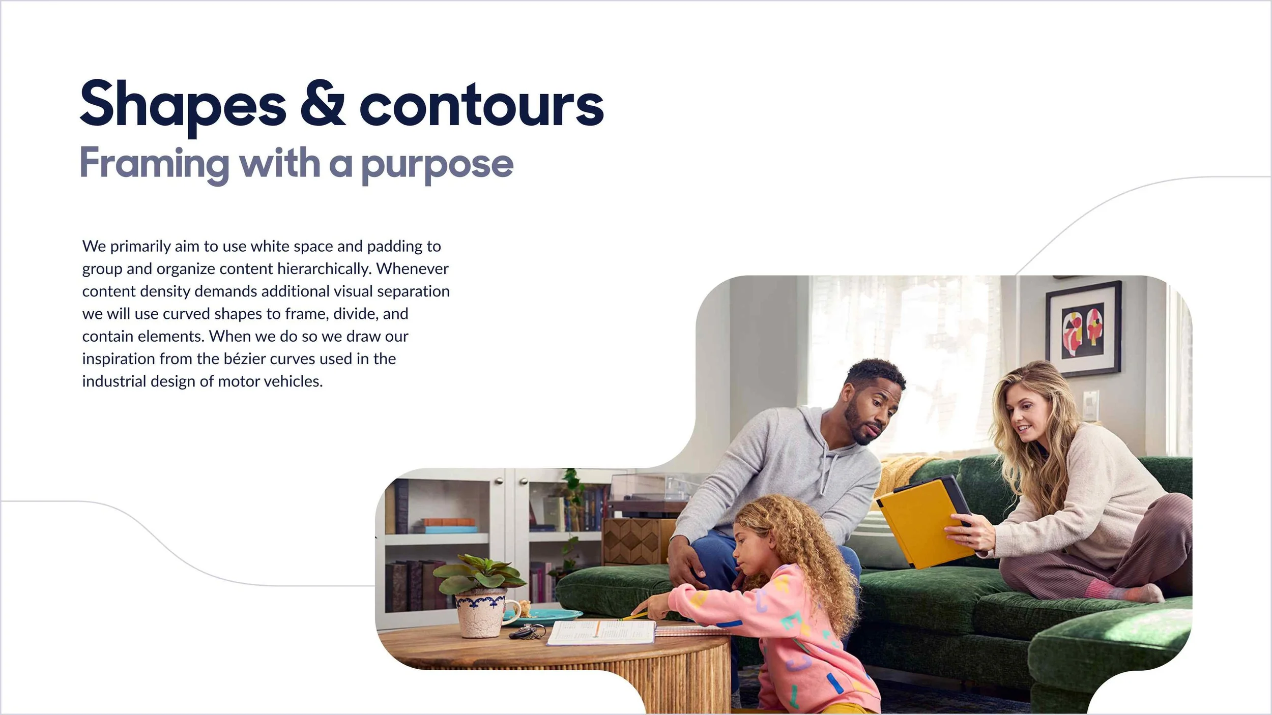
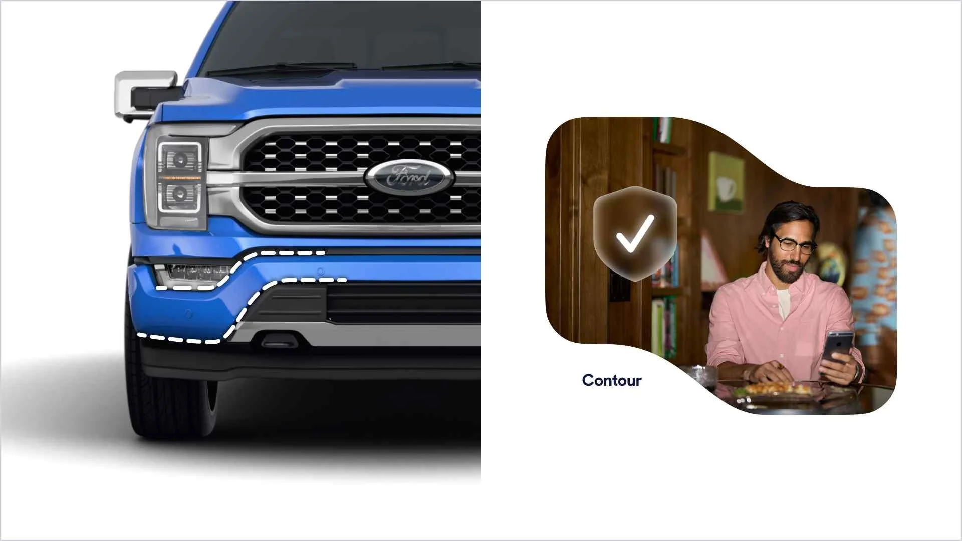
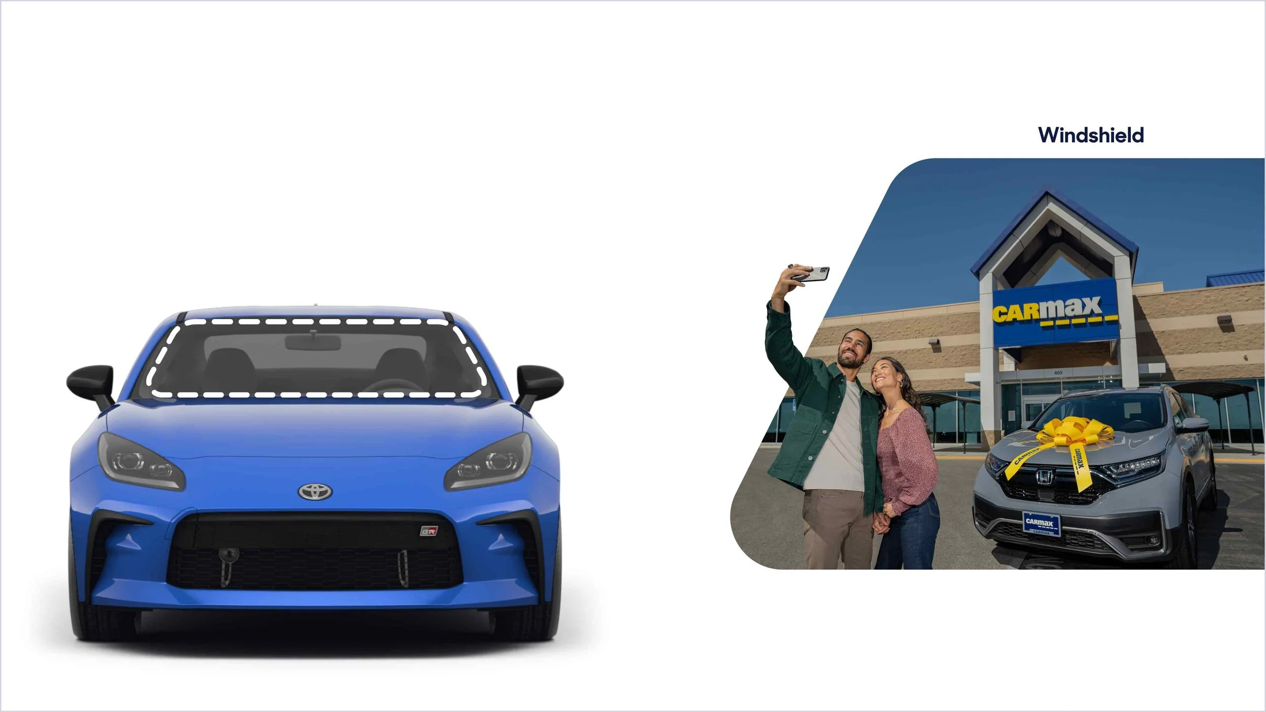
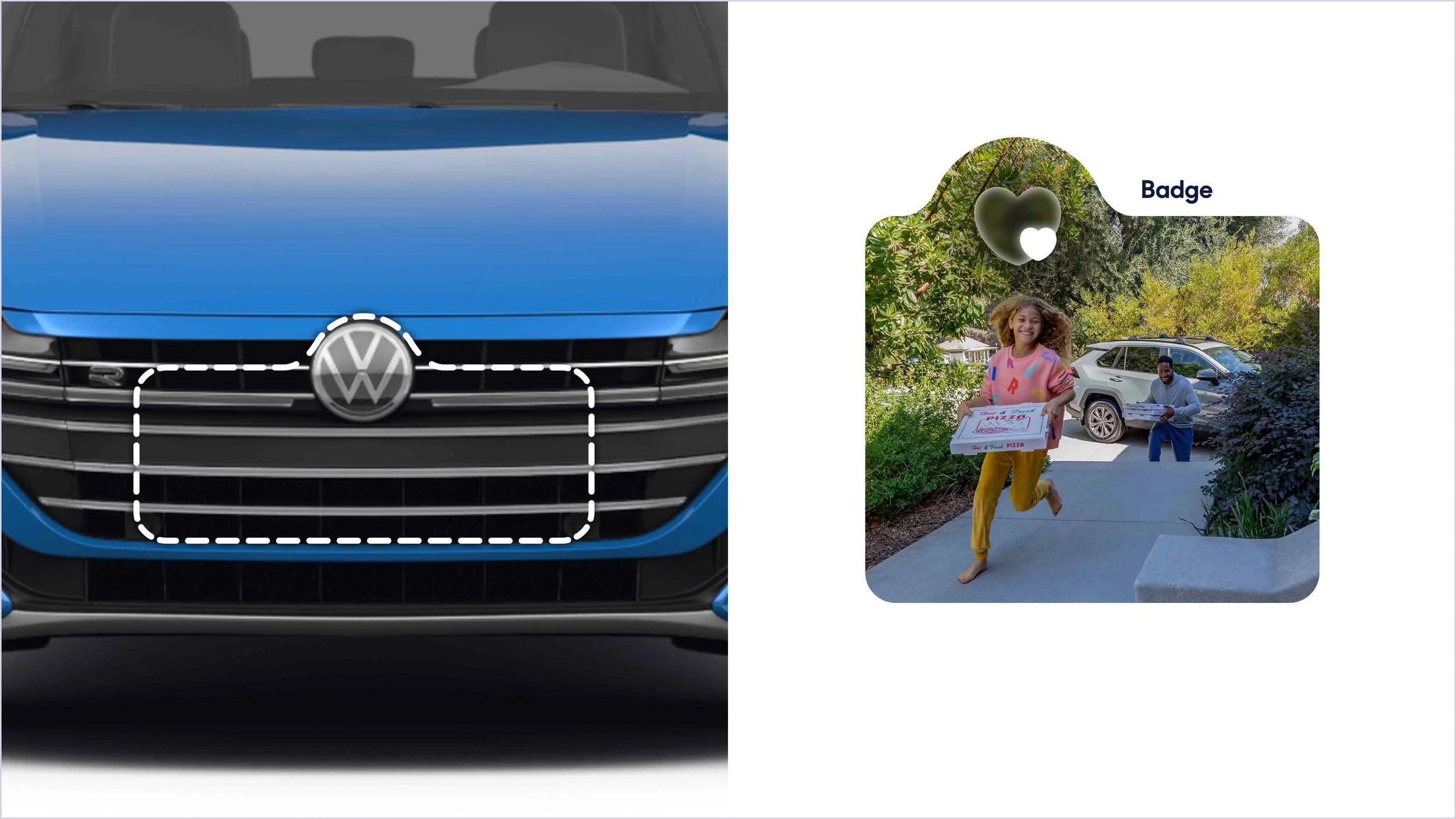
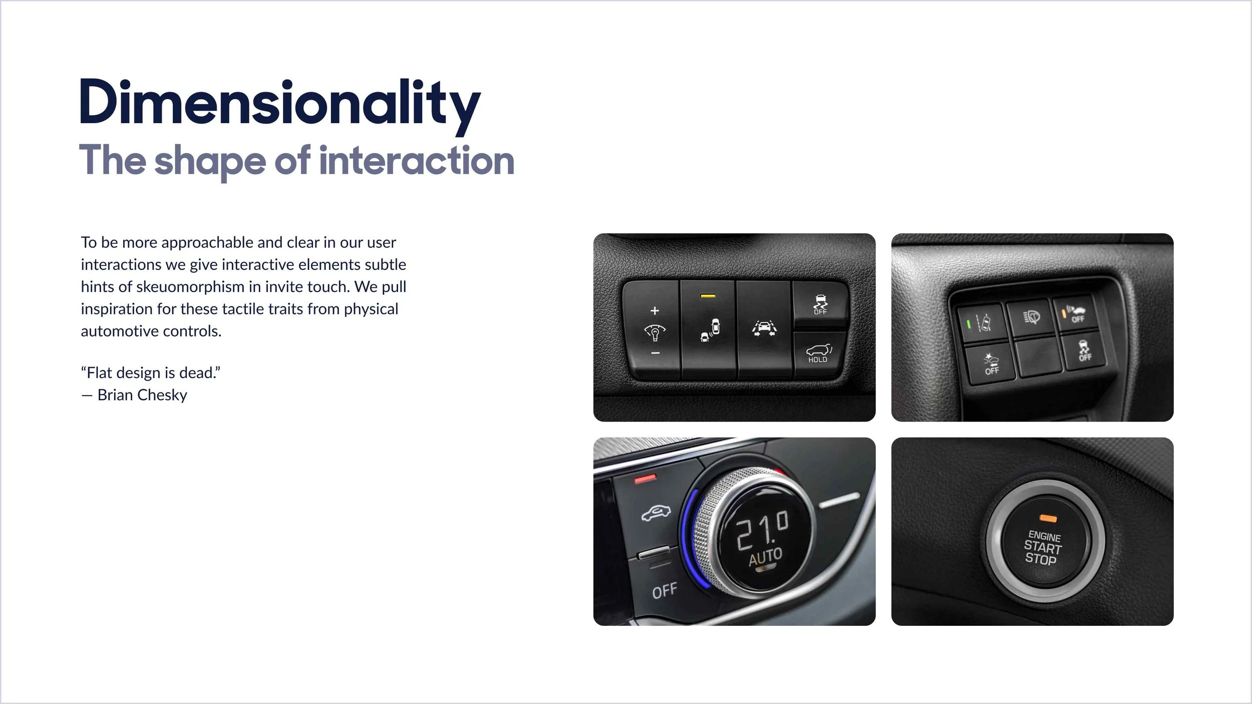
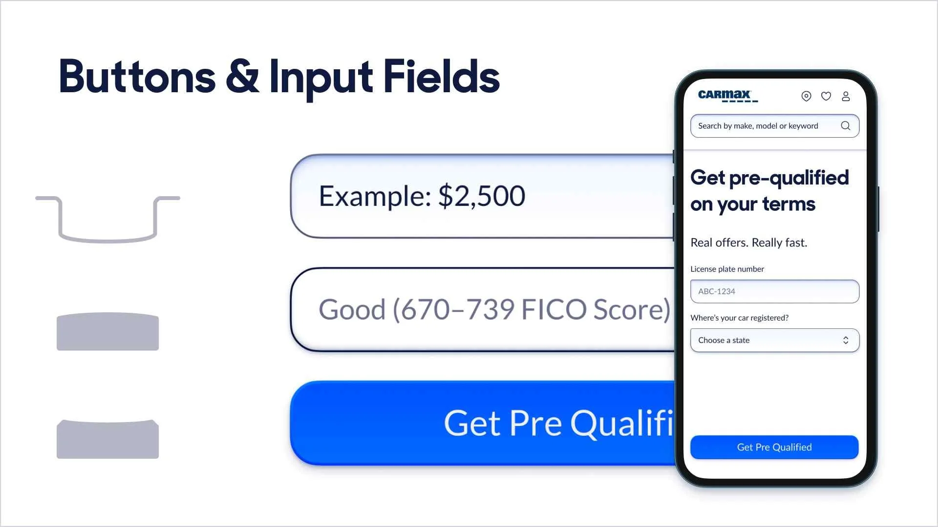
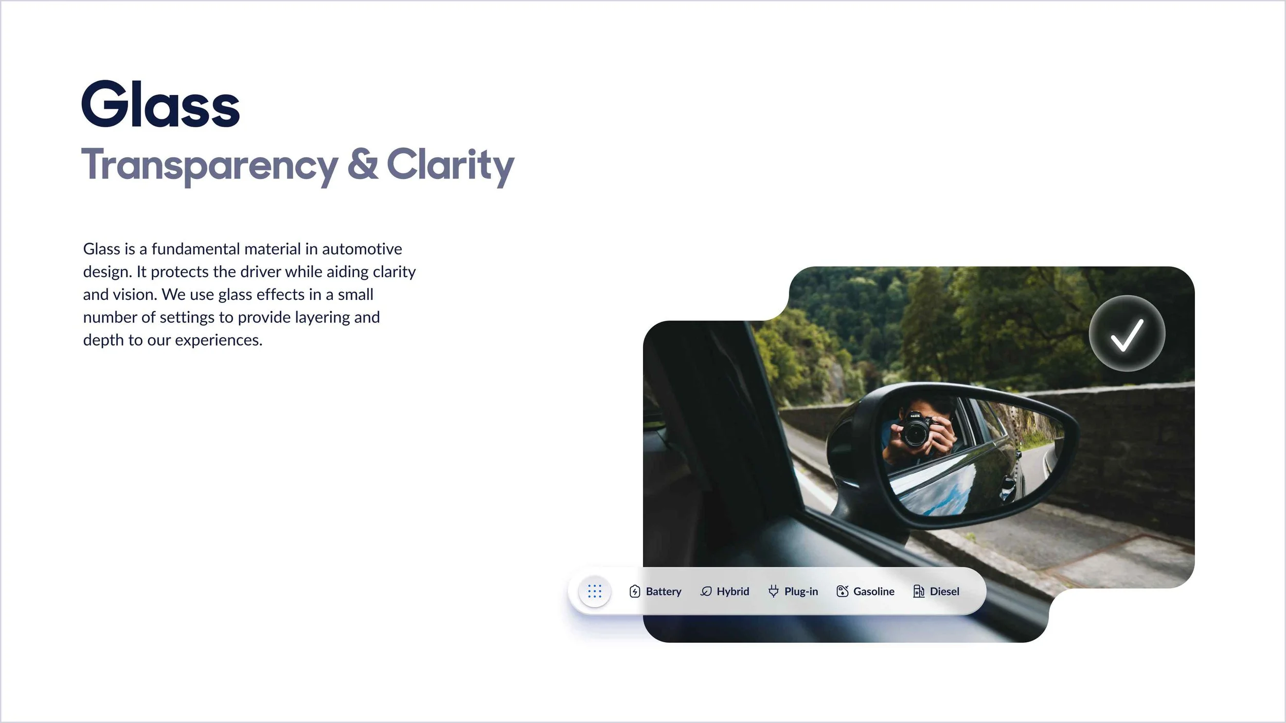
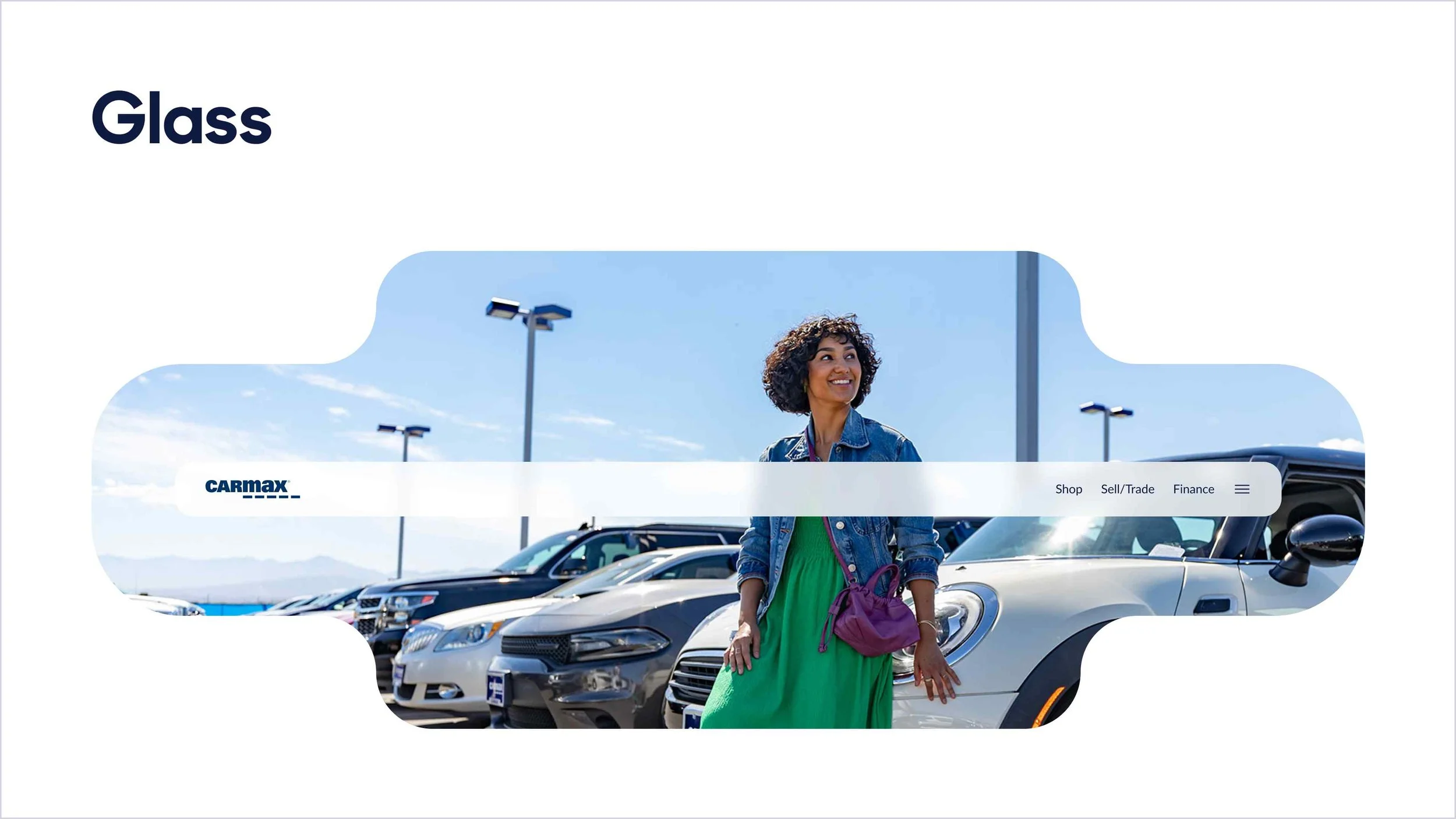
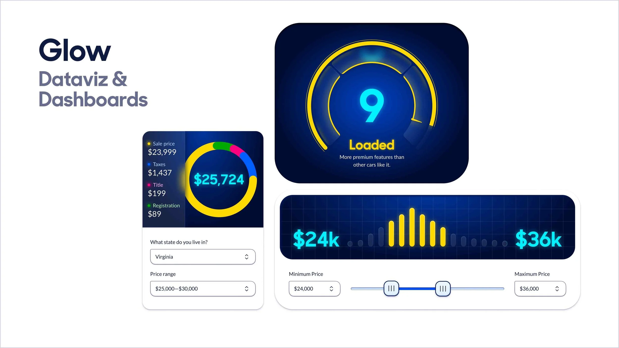
My solution was to start with our brand strategy called “Brighten The Road Ahead.” I translated the language of that brand strategy into CarMax’s first ever set of visual design principles. With a set of guiding principles in place I was able to build a visual design language around foundations and styles. The foundations included color, space, corners, typography, and icons. The styles were inspired by the industrial design of automobiles and included elevation, shapes, dimensionality, and materials.
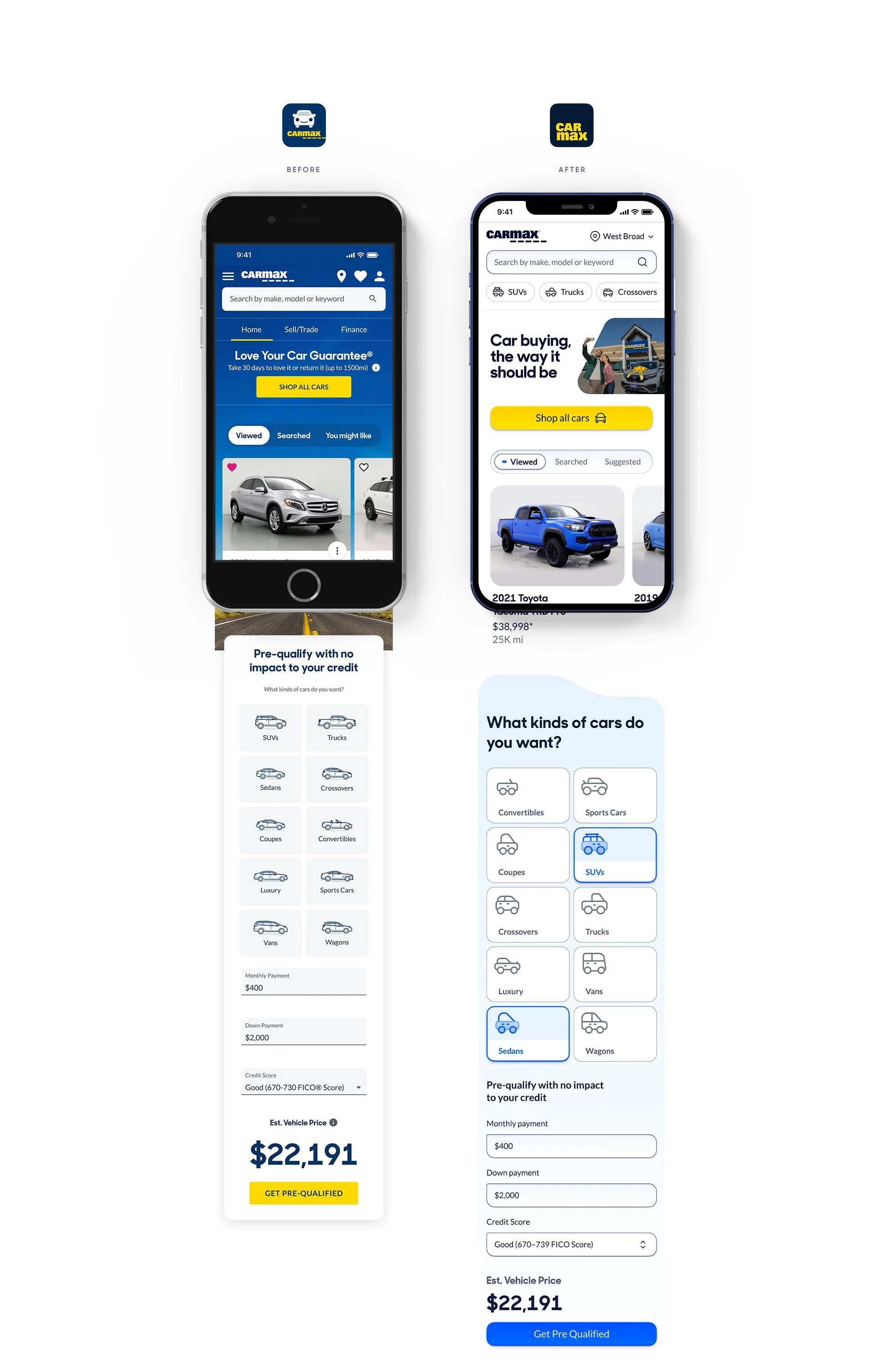


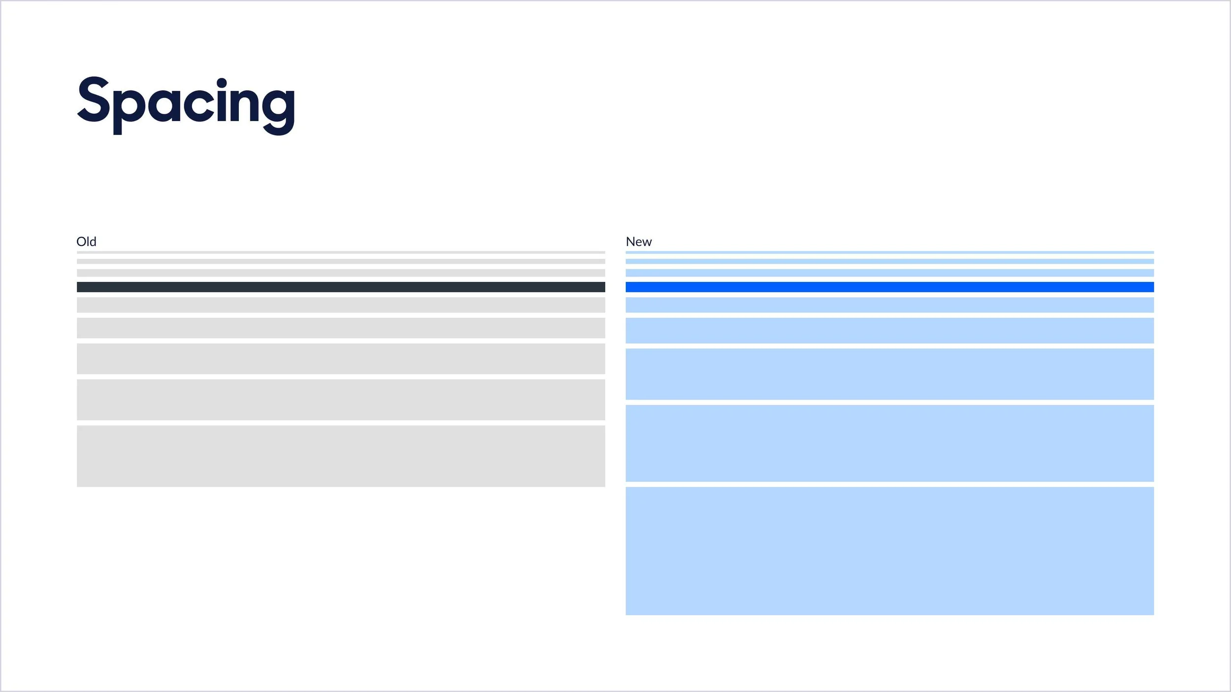

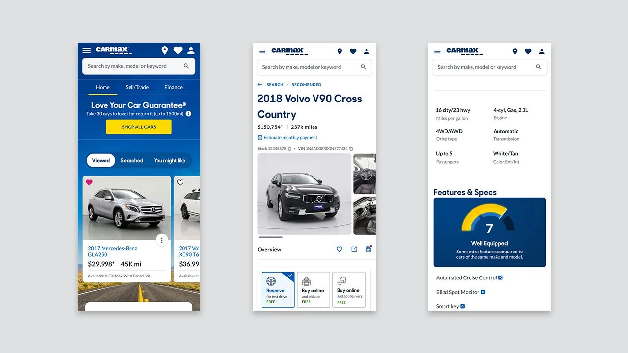
Before
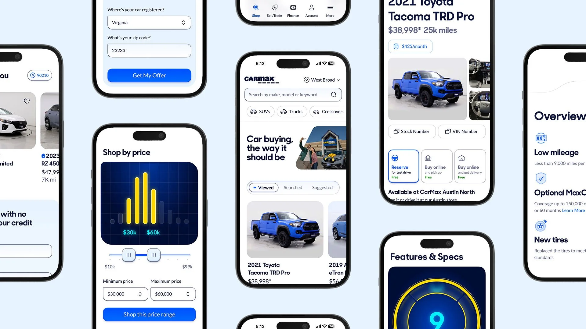
After
Results
The creation of CarMax’s first ever Visual Design Language.
End-to-end documentation and usage guidelines.
Managed rollout to 65 product teams impacting the work of thousands of employees driving tens of billions of dollars in annual revenue.
95% of participants in user testing graded the new design language as Approachable, Bright, and Clear.
200% increase in positive brand sentiment amongst Gen-z car shoppers.
76% increase in brand sentiment amongst used electric vehicle shoppers.
An immediate boost to accessibility and color contrast across the product org.
Making it real
This visual design language has been brought to life through our enterprise design system. To see how we turned theory into reality check out that case study.
More Work