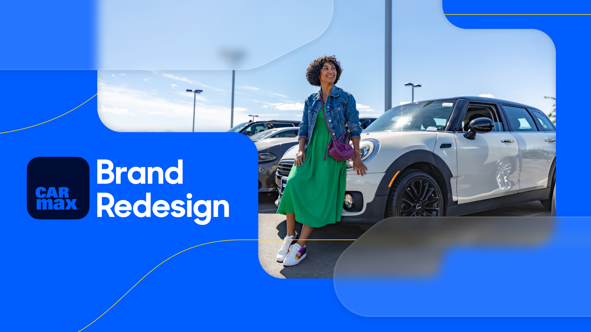
Building a design system for the future of used car shopping
Background
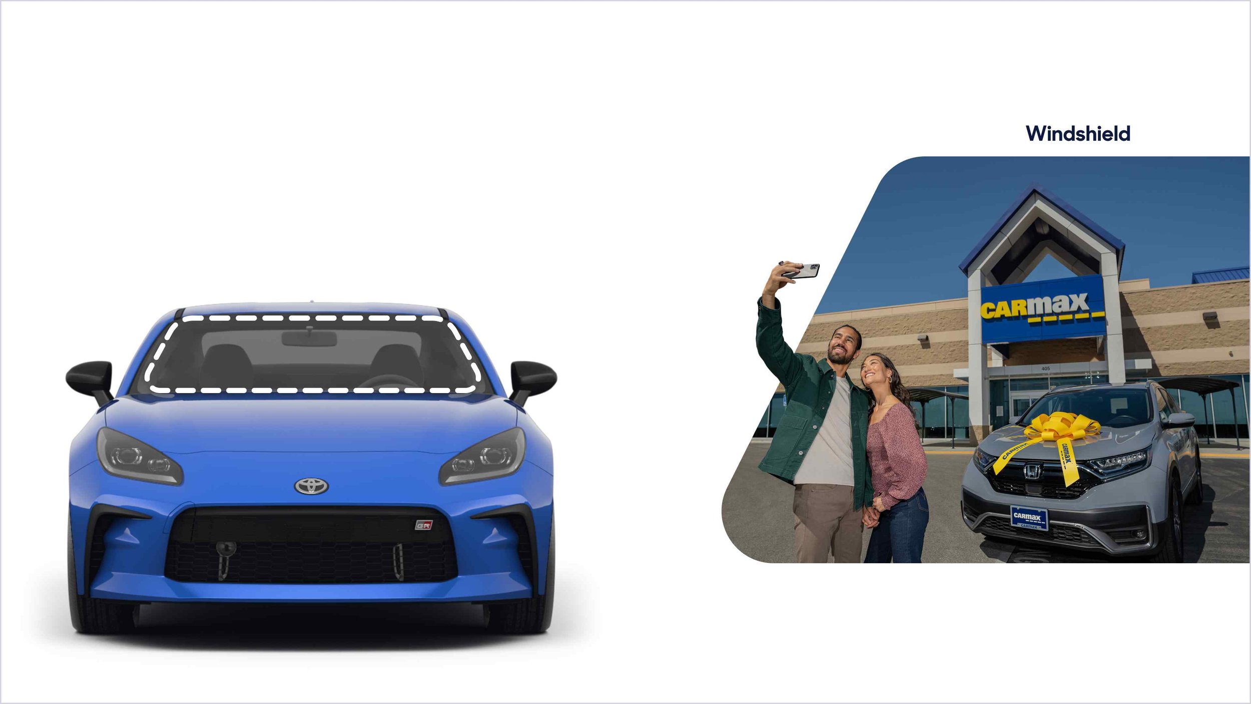
Car buying is a significant milestone, but too often, the digital experience feels overwhelming, transactional, or needlessly complex. At CarMax, we believe it should be different—buying a car should feel as exciting as driving one. That’s why we built a design system rooted in three core visual principles: Approachable, Bright, and Clear.
The Problem
CarMax’s digital ecosystem had grown rapidly, leading to inconsistencies in UI patterns, visual styles, and interaction models. Without a unified system, designers and engineers spent valuable time reinventing solutions, leading to inefficiencies and a fragmented user experience. Customers, in turn, encountered unclear navigation, inconsistent visuals, and a lack of cohesion across touchpoints—making what should be an exciting journey feel like a chore.
The Solution
To solve these challenges, I led the creation of a new design system that translated our visual design principles into a scalable, cohesive, and accessible framework. By defining a structured set of color semantics, typography guidelines, component libraries, and interaction patterns, we provided teams with the tools to design experiences that feel inviting (Approachable), optimistic (Bright), and prioritize clarity (Clear). The result? A system that not only streamlines design and development workflows but also ensures that every customer interaction reflects the trust and ease that CarMax stands for.
Foundations
Color: Primitive Ramps
With newly articulated visual design principles aligned to our brand strategy we knew we needed to revisit the core of our color palette. I used Hayk An’s powerful color ramp tool Scale to develop ramps with controlled saturation, hue shifts, and maximum lightness and darkness values. The goal was to make the brand feel brighter and more approachable while maintaining scalability and accessibility.
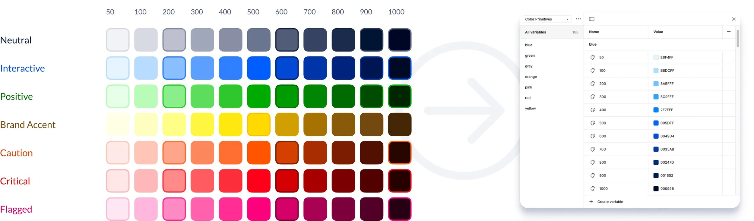
Color: Tonal Tokens
Exposing full color ramps to members of the design system team and the broader product design organization would create uncertainty about usage. To avoid that we constructed a set of abstractions to serve as shorthand for a collection of values that serve a role within each messaging tone, and that can be arranged into useful elements within components.
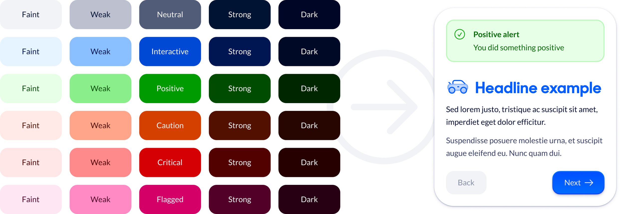
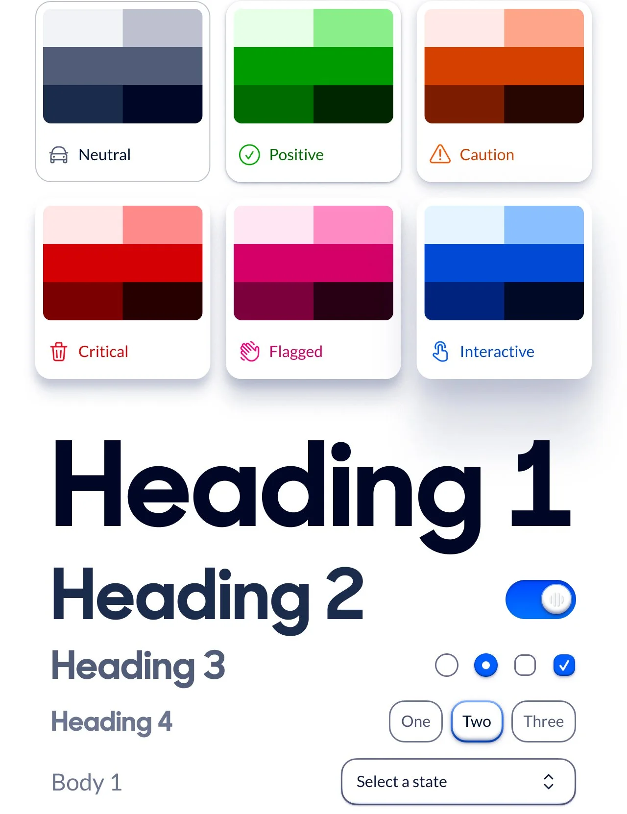
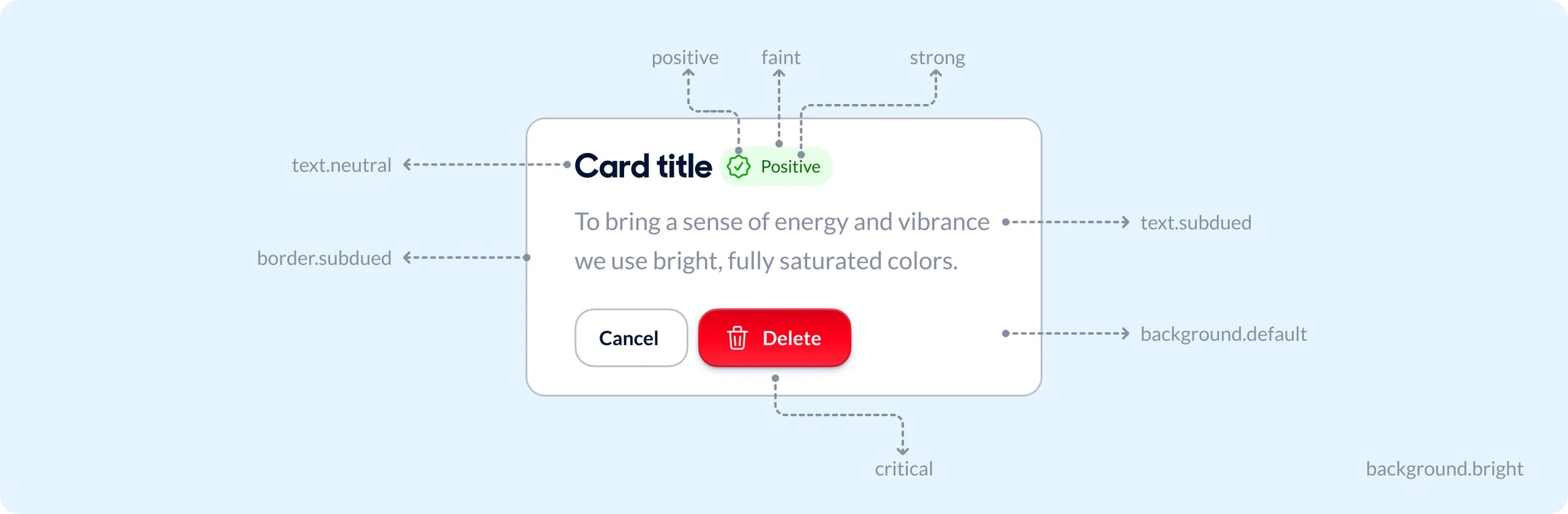
Color: Semantic Tokens
When defining the design system’s color strategy, I translated raw color primitives into meaningful semantic tokens to ensure consistency and scalability across the product org. By mapping base colors to roles—such as neutral, subdued, and tone-specific variants—I created a structured system that adapts to different scenarios and use cases. This approach not only standardized usage but also empowered designers and engineers to implement colors with clear intent, reducing ambiguity and streamlining decision-making.
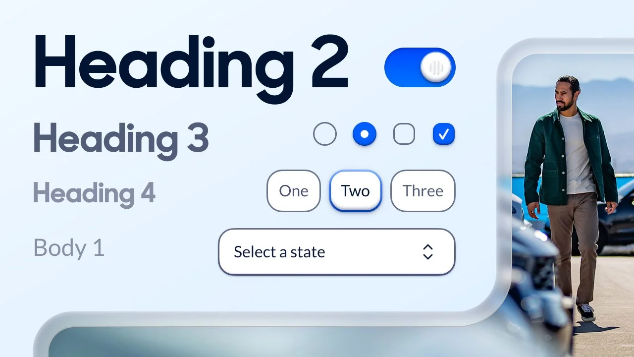
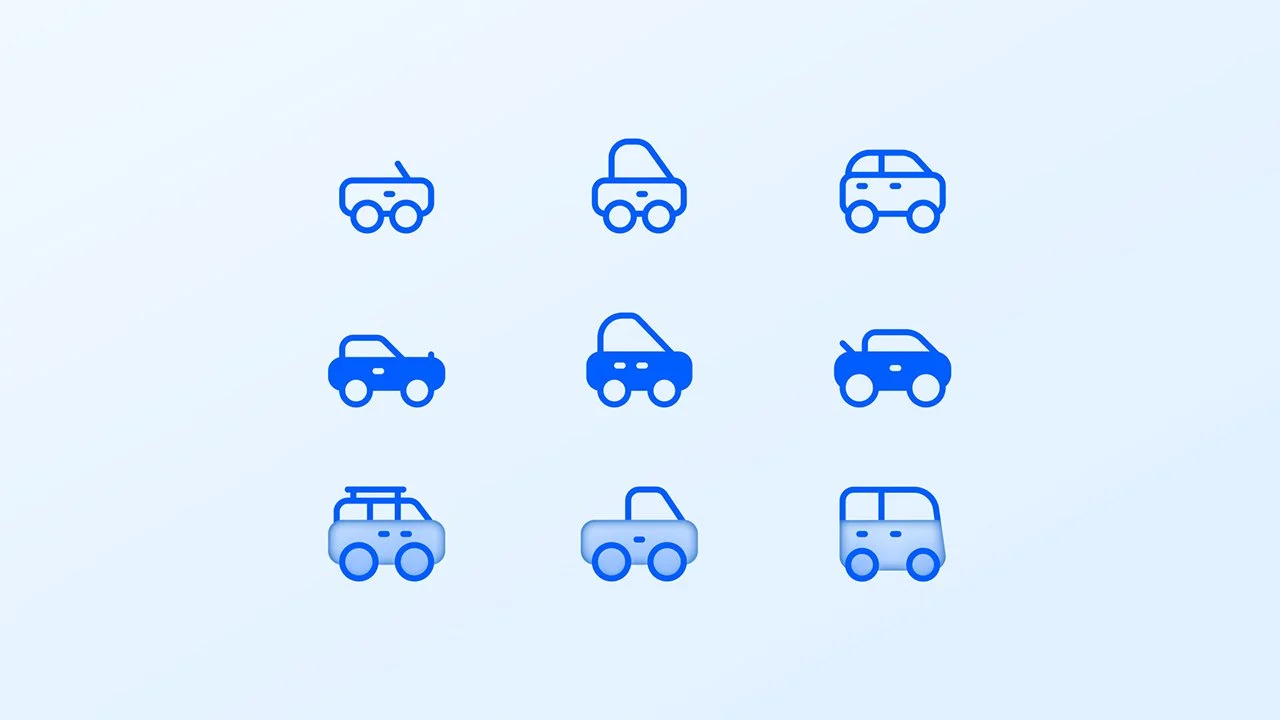
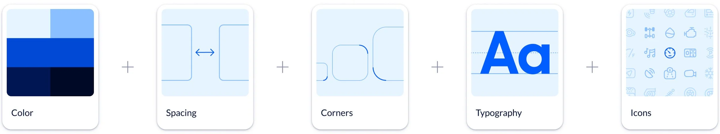
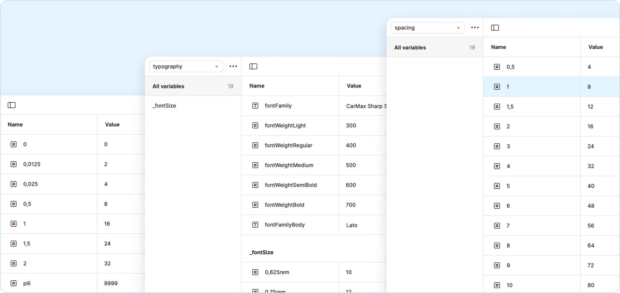
Corners, Spacing, Typography, and Icons
We built the rest of our foundational design tokens with the same semantic variable approach we took to color. Here is a deep dive on Iconography.
Components
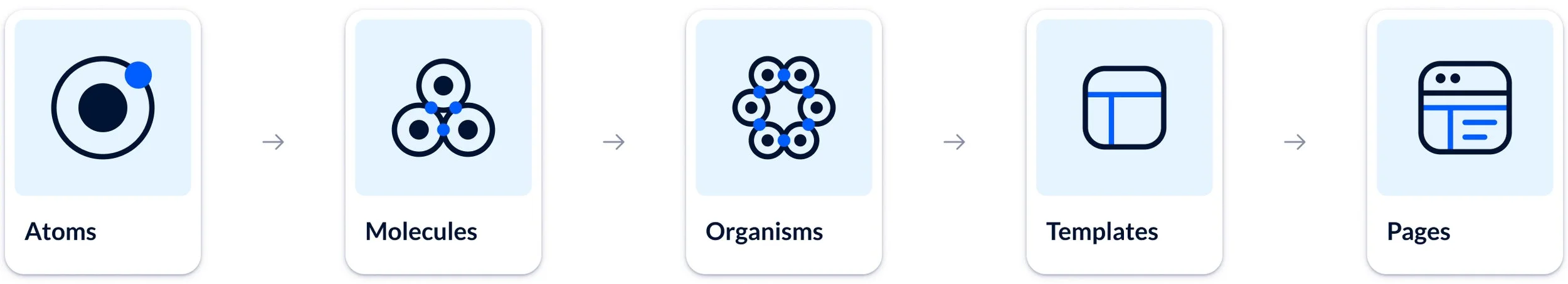
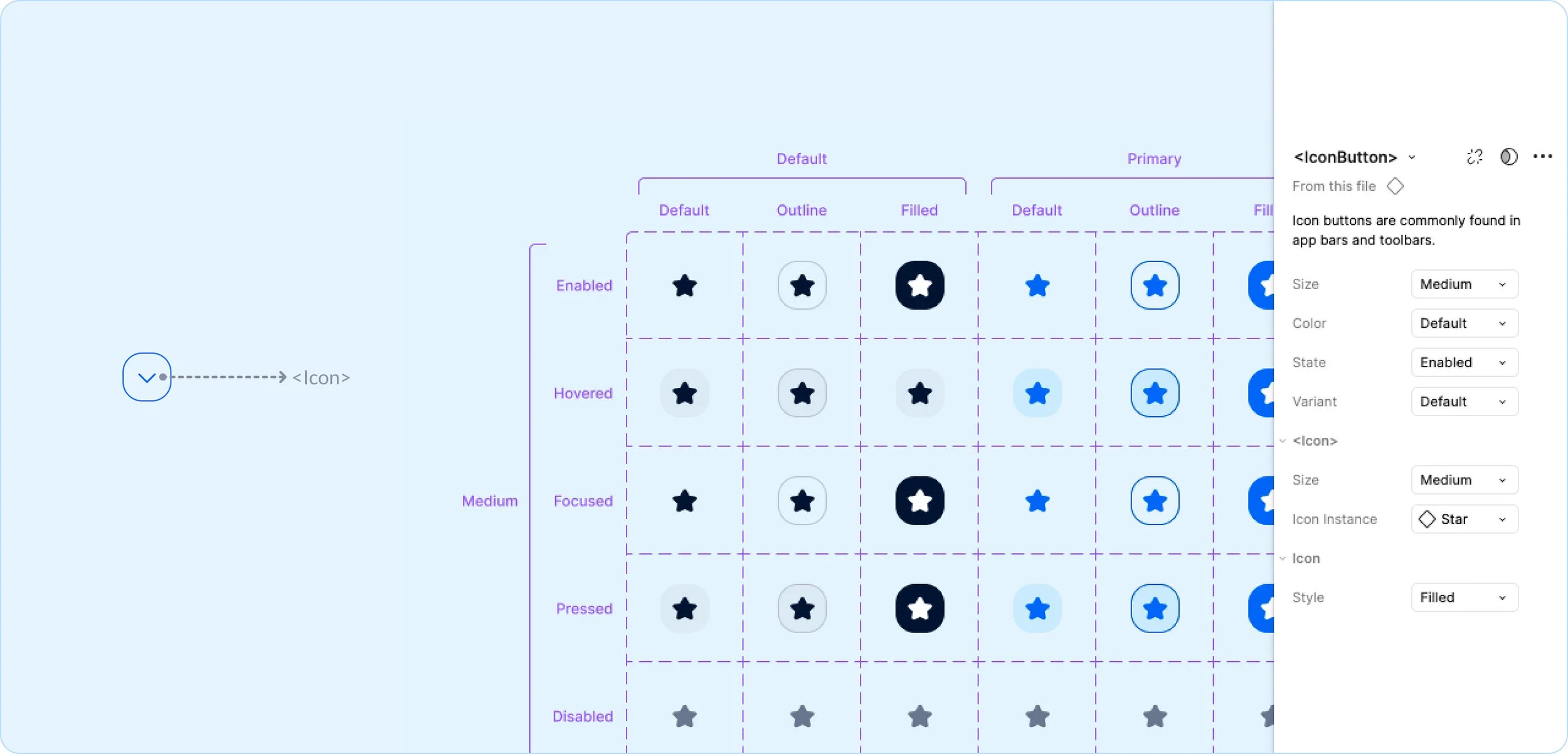
Atoms
An "atom" in a design system is the smallest, indivisible UI element, like buttons, icons, or inputs. These fundamental building blocks establish consistency and reusability, forming the foundation for more complex components and patterns within a cohesive design system.
This example is an <IconButton> which is an <Icon> with a frame around it to allow for size, state, color, and style properties.
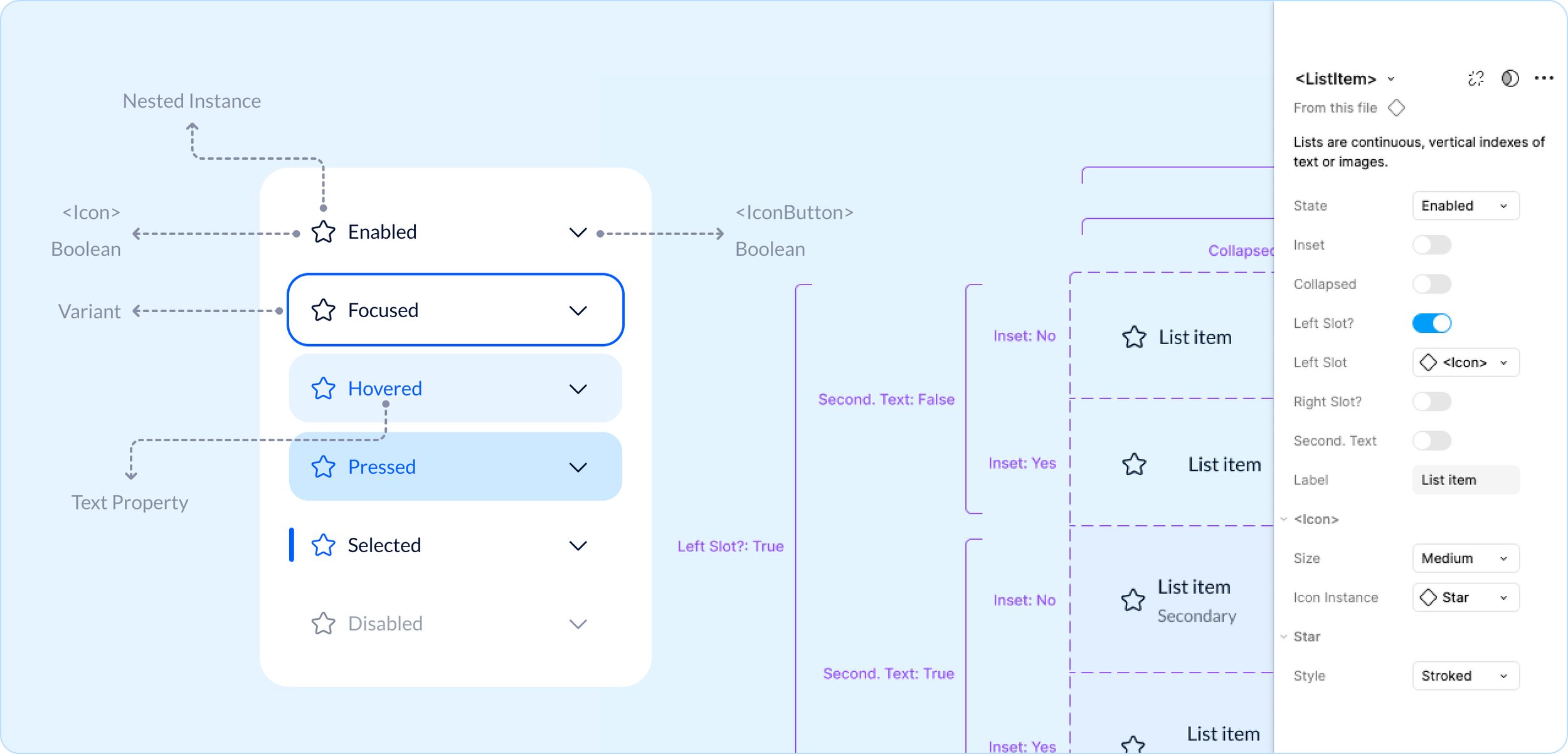
Molecules
A "molecule" in a design system is a small, reusable UI component made of multiple atoms, like a search bar (input + button). These self-contained units establish structure and functionality, serving as building blocks for more complex components and ensuring design consistency.
This example is <ListItem> from our core design system library. It is an arrangement of <Icon> <IconButton> <Typography> with booleans, text properties, and interaction states.
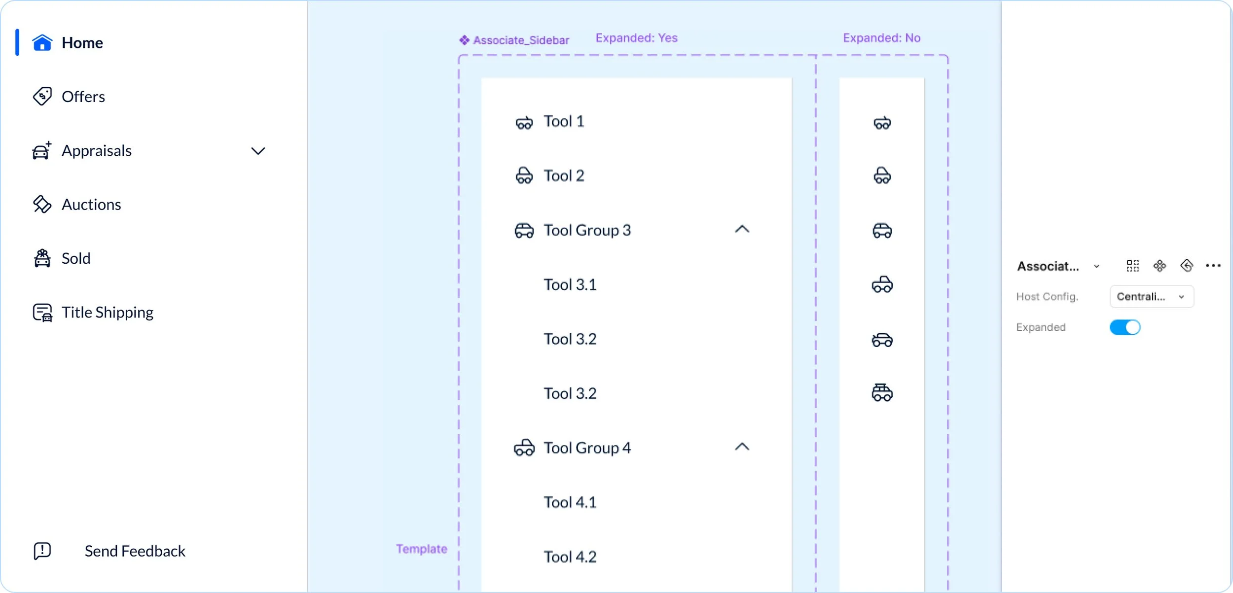
Organism
An "organism" in a design system is a complex UI component made of multiple molecules and atoms, like a navigation bar or a card. These larger structures define distinct sections of an interface, promoting consistency, scalability, and usability across a design system.
This example is a <SideBar> from our Associate Facing library. It is an arrangement of a <List> inside of a <Drawer> component.
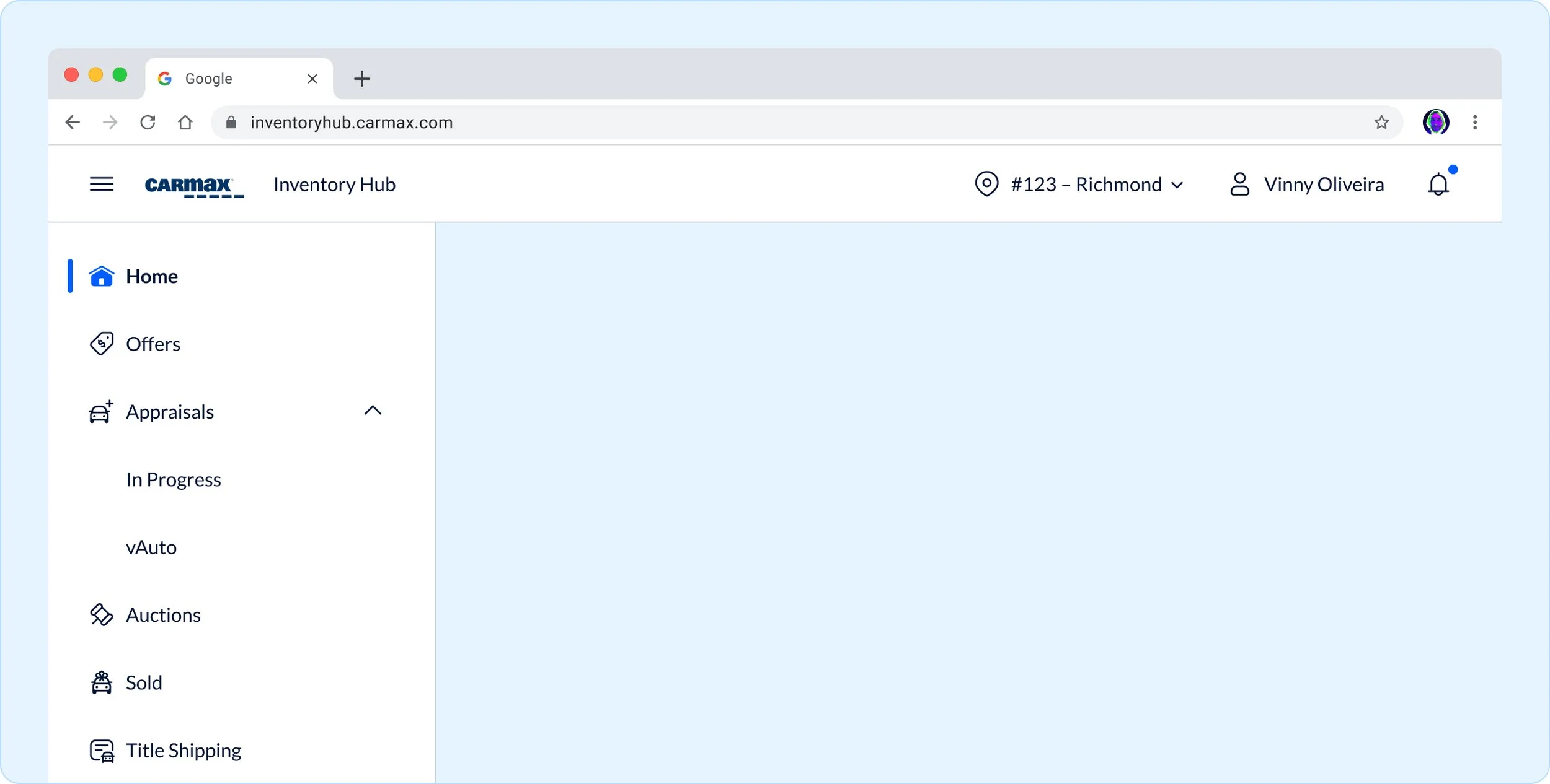
Template
A "template" in a design system is a layout structure that arranges organisms, molecules, and atoms into a cohesive design without final content. It defines hierarchy, spacing, and flow, ensuring consistency while allowing flexibility for different use cases and content types.
This example is from our Associate Facing design system and it is an arrangement of <SideBar> and <AppBar>.
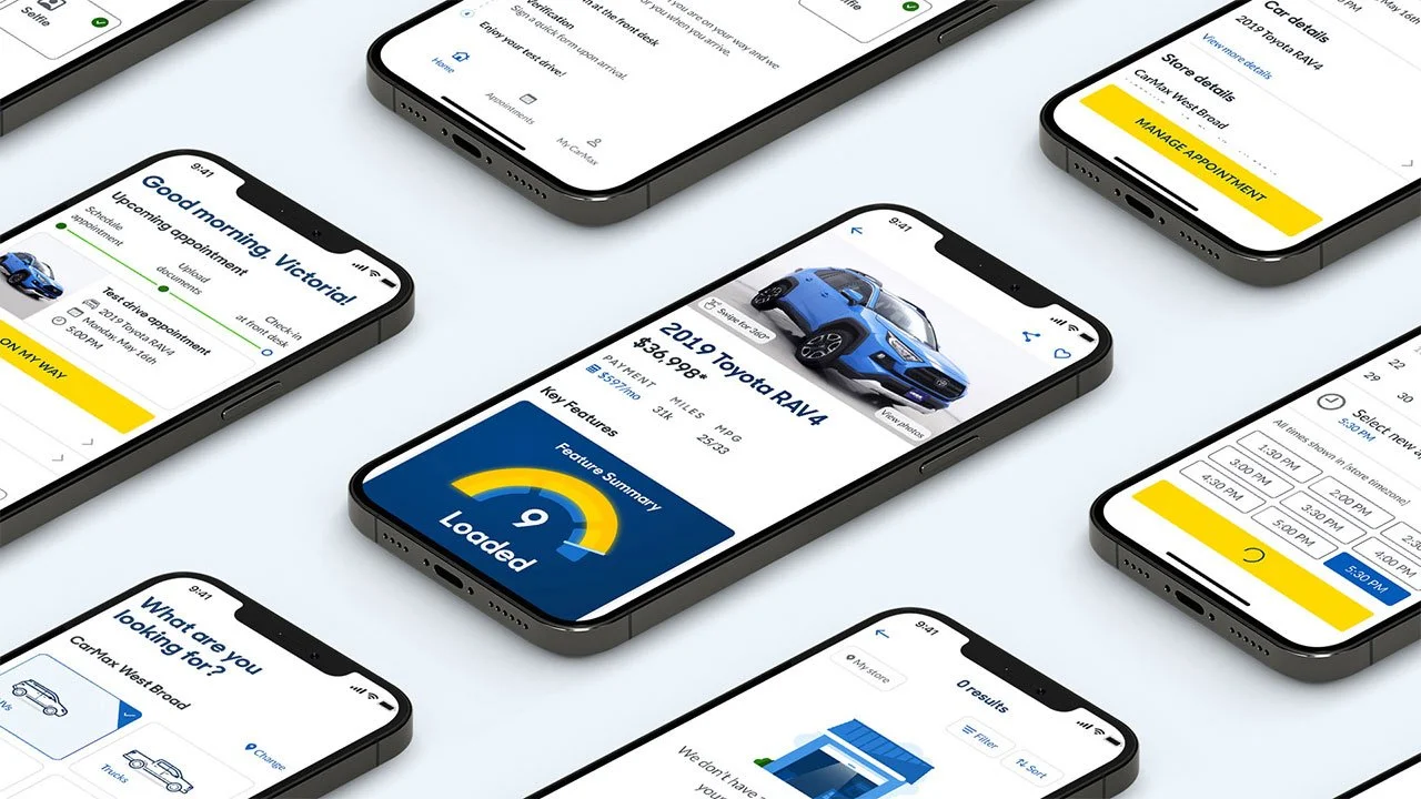
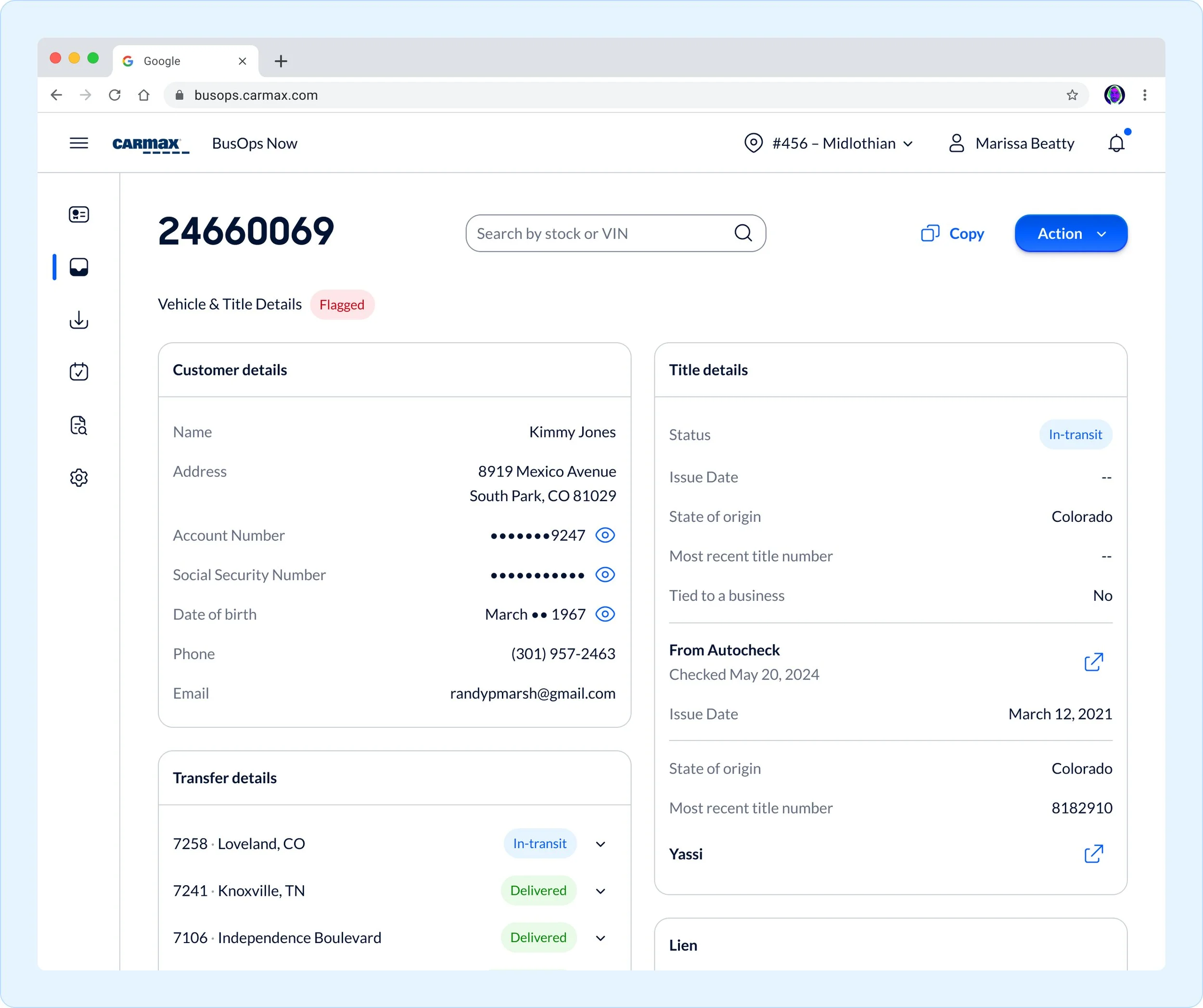
Pages
A "page" in a design system is a fully realized instance of a template, combining final content with design components. It represents a complete user experience, ensuring consistency, usability, and alignment with the system’s visual and functional standards across different screens.
This example is from our Title Management Hub within the Central Business Office.
Bringing automotive styling to life in the design system
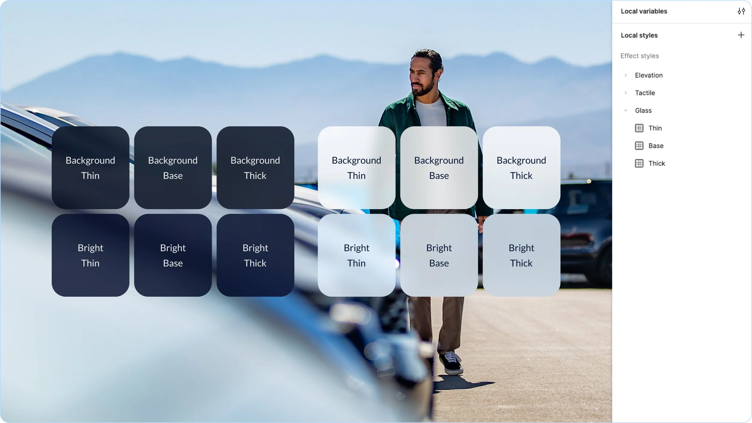
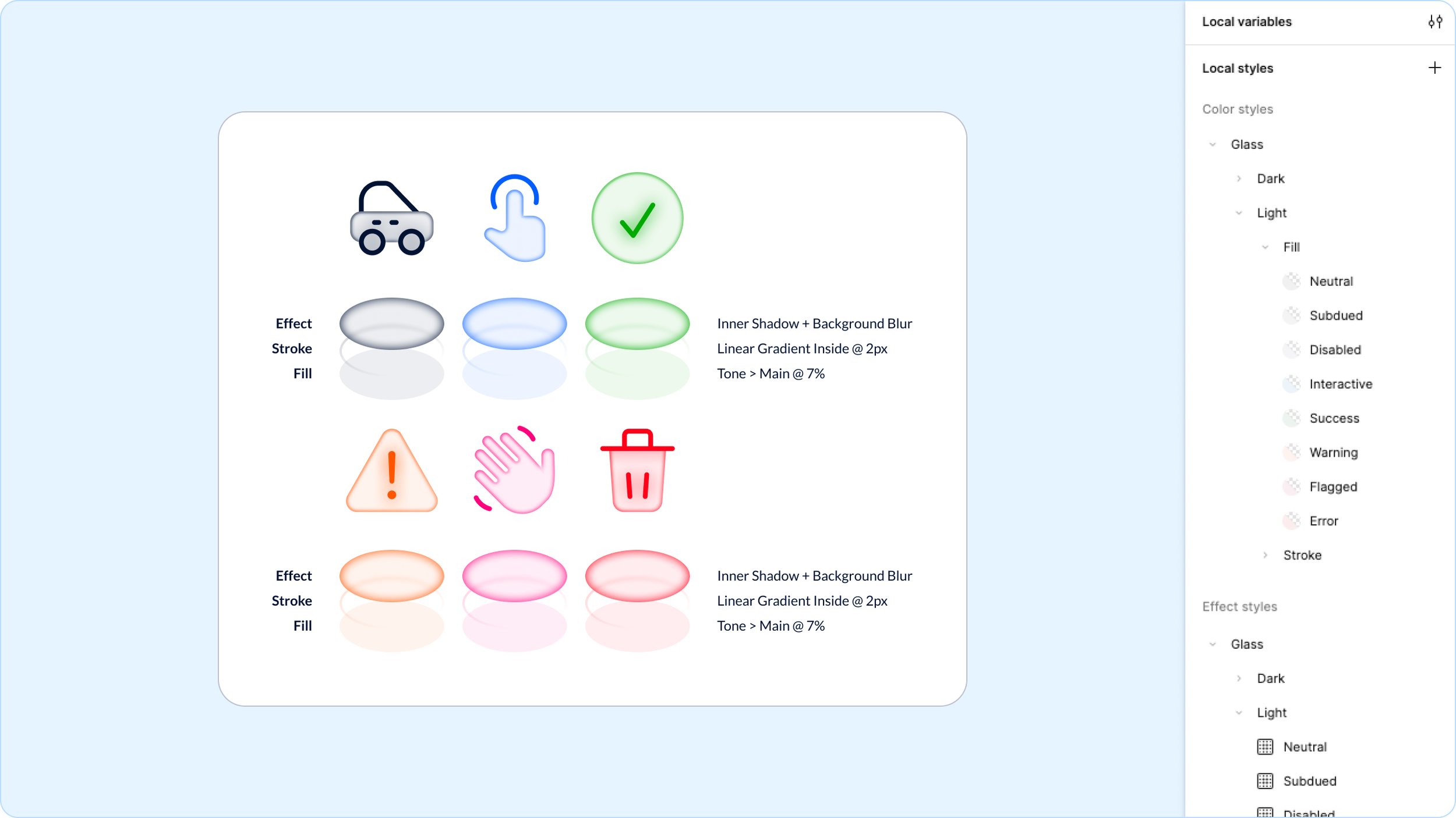
Glass
Transparency & Clarity
Glass is a fundamental material in automotive design. It protects the driver while aiding clarity and vision. We use glass effects in a small number of settings to provide layering and depth to our experiences.
Dimensionality
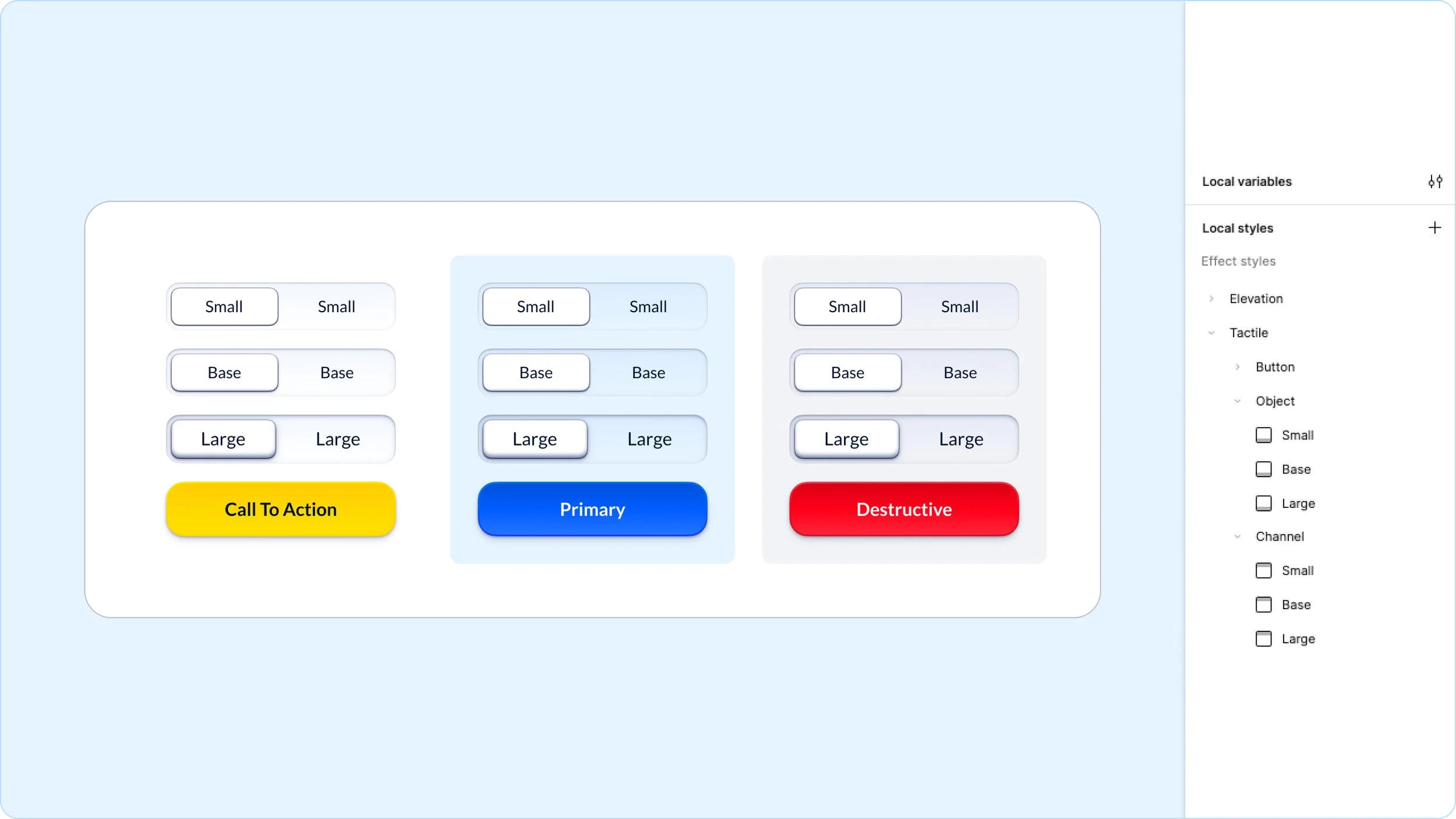
The shape of interaction
To be more approachable and clear in our user interactions we give interactive elements subtle hints of skeuomorphism in invite touch. We pull inspiration for these tactile traits from physical automotive controls.
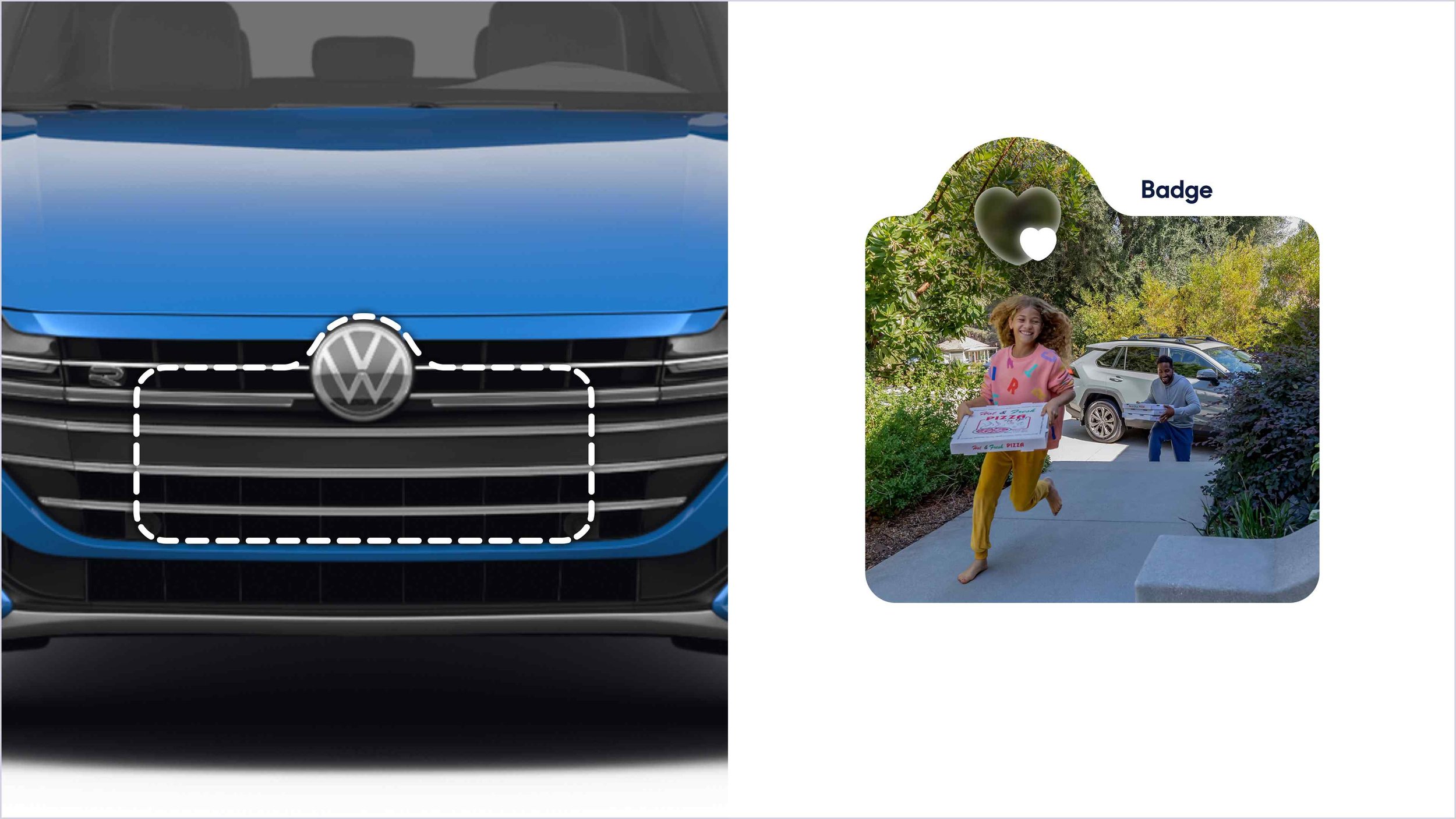
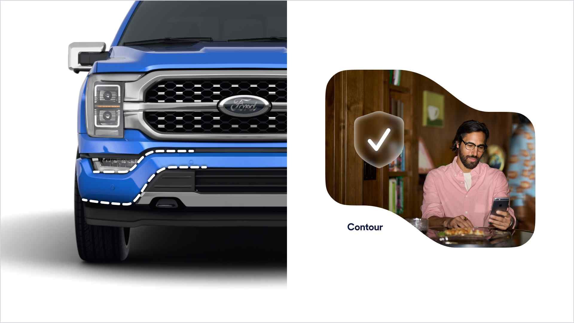
Shapes & contours
Framing with a purpose
We primarily aim to use white space and padding to group and organize content hierarchically. Whenever content density demands additional visual separation we will use curved shapes to frame, divide, and contain elements. When we do so we draw our inspiration from the bézier curves used in the industrial design of motor vehicles.
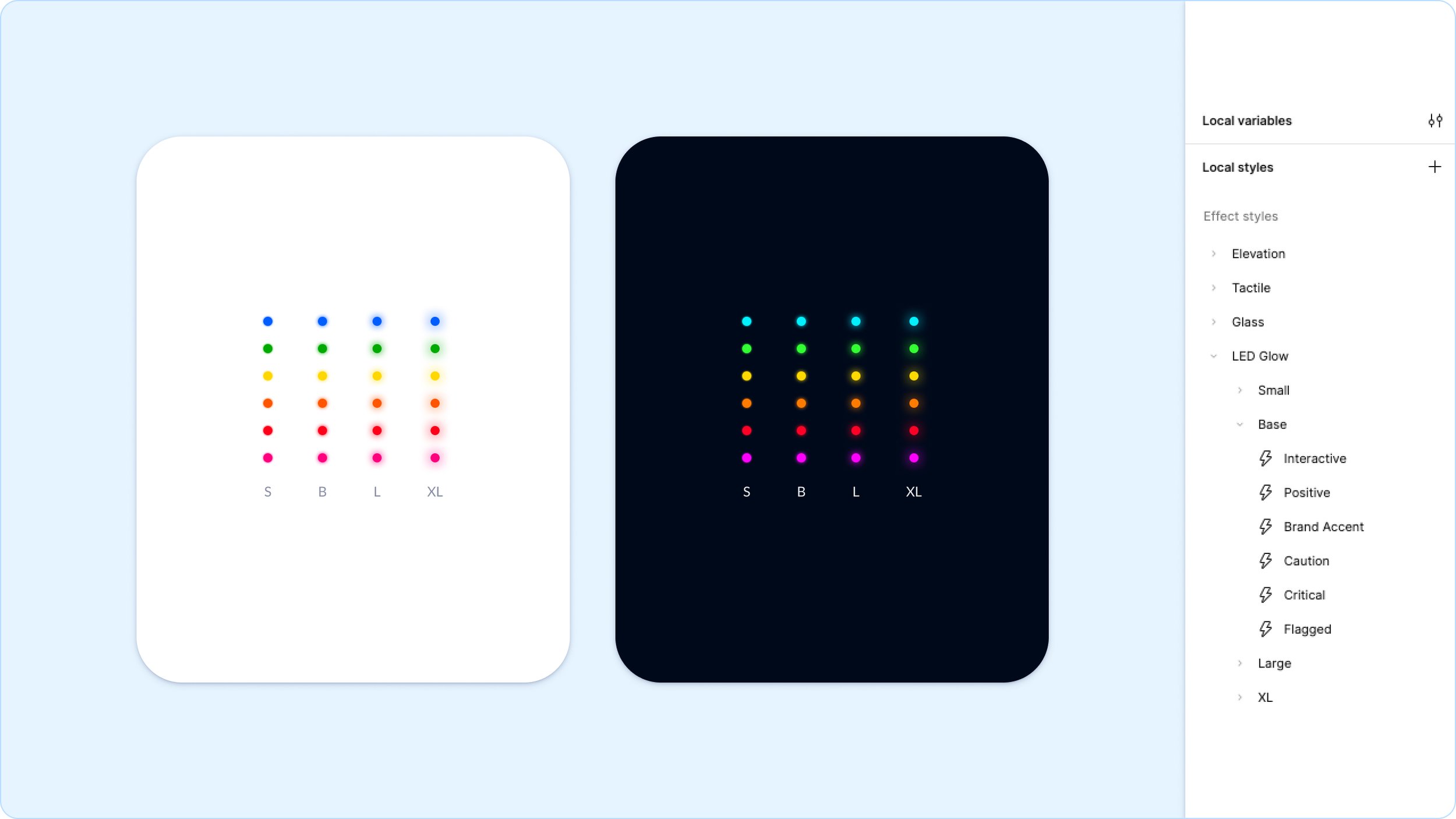
Dashboard Displays
The warm glow of plastic and LEDs
The bond between car and driver is held together by constant feedback from the machine in the form of numbers, meters, and dials. To aid clarity those objects are often backlit and glowing so that they are easily visible in the dark and at a glance. How can we recreate that futuristic glow while maintaining the principles of approachability and brightness?
Results
50% reduction in development time, thanks to Material React components.
Increased design consistency across 50+ products, reducing UI-related QA feedback by 40%.
Adoption rate of 45% across cross-functional teams within the first 6 months. Projected to be 75% by month 12.
Cut down redundant design work in half, enabling teams to focus on solving higher-level UX challenges.
Improved accessibility compliance, with 100% of components meeting WCAG 2.1 AA standards.
Streamlined onboarding for new designers and engineers, cutting ramp-up time from 4 weeks to 2.
Facilitated smoother cross-team collaboration, aligning design and engineering with shared language and reusable tokens.
Enabled faster iteration, with UI updates deployed 3x faster through a centralized system.